graphic-art, painting, watercolor
#
graphic-art
#
art-nouveau
#
painting
#
watercolor
#
decorative-art
Dimensions: height 81 mm, width 155 mm
Copyright: Rijks Museum: Open Domain
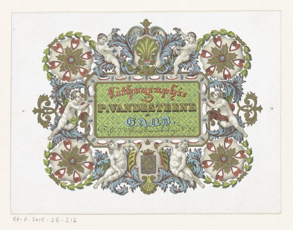
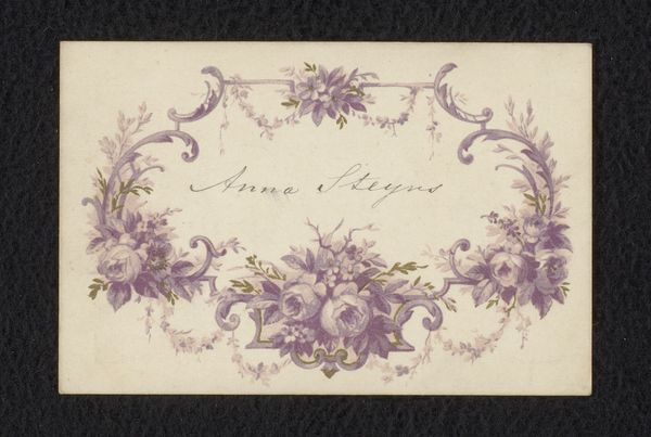
Curator: Before us is a piece titled "Ontwerp voor een etiket voor jublileumjam," which translates to "Design for a Jubilee Jam Label," created sometime between 1884 and 1952 by Reinier Willem Petrus de Vries. It appears to be watercolor on paper, demonstrating strong Art Nouveau influences. Editor: It’s a sweet little thing, literally and figuratively! The palette is muted – predominantly pale yellow, with accents of leafy green and the subtle pop of those red berries, I think, around the frame. I notice a hand-crafted quality, like an artisanal, unique product. Curator: Precisely! Consider the historical context: Art Nouveau emerged during a period of rapid industrialization. Artists reacted by emphasizing handcrafted, decorative arts. Pieces like this label elevate everyday objects, and it can be seen as part of a larger socio-political move, rejecting mass-produced designs for items that were aesthetically inclined. Editor: The use of watercolor is critical, adding an artisanal touch. The "70" at the top implies this was made for a seventieth jubilee celebration of a business. It gives the packaging a mark of distinction, an individualization beyond mere branding. The symmetry feels intentional too, each leaf and cherry placed with delicate intention. You could imagine it being painstakingly hand-applied in series. Curator: Absolutely. It connects to the broader movement toward reforming taste and visual culture within society. The integration of art and craft in commercial design challenged established hierarchies of high and low art, making aesthetics more accessible. It served a clear, political function as well. Editor: You know, seeing this design also makes me think of the often unacknowledged labor behind packaging. A craftsperson, possibly even a woman, spending hours to bring such exquisite visual texture to… jam. It underscores that even our consumables are bound with design choices, reflecting labor conditions. Curator: A valid point, highlighting the tension between aesthetic appeal and the realities of production within the burgeoning capitalist system of the time. Was the beauty for all or only the affluent? Editor: Exactly. Something so accessible on its surface opens questions about consumption, labour, and class in that period. I will have some jam now, please. Curator: Me too! Thinking about the labor that may be represented here has made me appreciate it differently, not just for its pleasing visuals.
Comments
No comments
Be the first to comment and join the conversation on the ultimate creative platform.
More like this