About this artwork
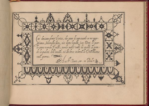
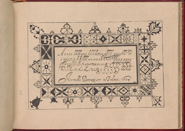
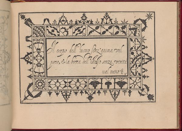
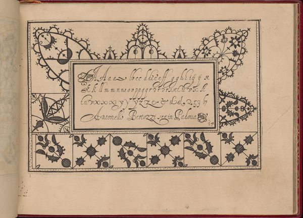
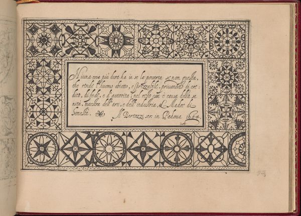
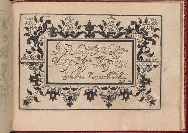
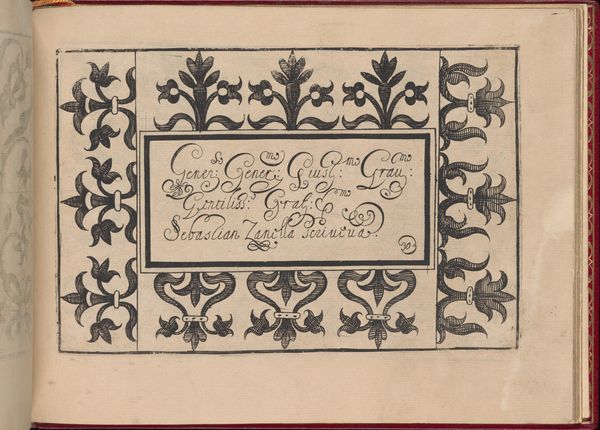
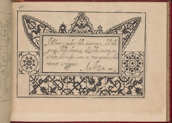
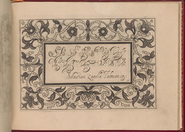
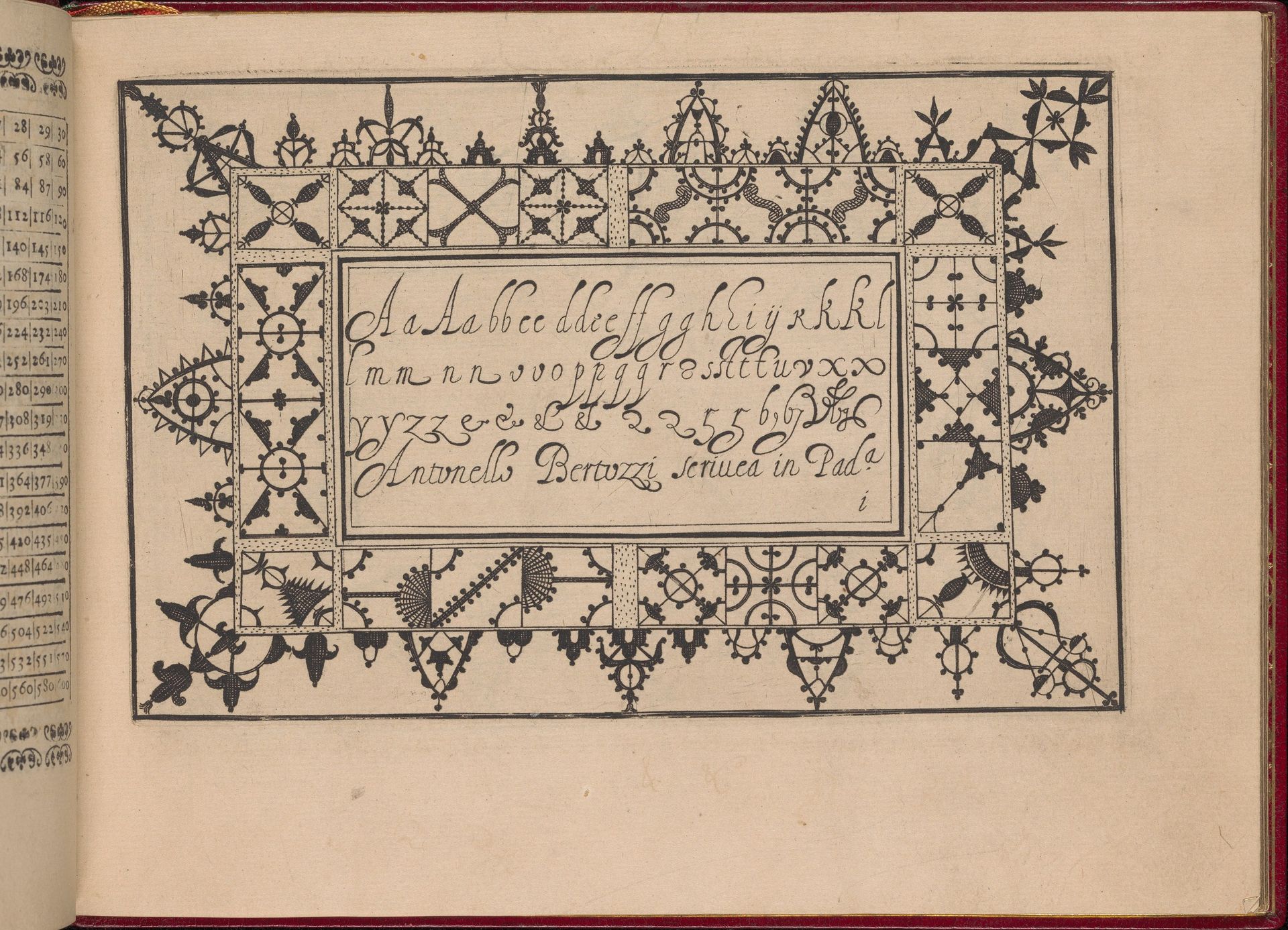
Editor: Here we have a page from *Ghirlanda: Di sei vaghi fiori scielti da piu famosi Giardini d'Italia* created in 1604 by Pietro Paulo Tozzi. It’s a print drawing in ink on paper. What strikes me is the frame; it looks like some kind of secret cypher or symbolic border, yet encloses a very standard if beautiful, alphabet. How do you read the relationship between text and frame? Curator: The alphabet nested within a highly ornamented border immediately brings to mind illuminated manuscripts, echoing traditions of emphasizing text with sacred and symbolic weight. Consider how geometric patterns resonate across cultures; these intricate borders almost invoke architectural spaces – perhaps, suggesting a garden as both the title indicates and also a private world of the book, but what are your first thoughts? Editor: It's almost like the border *protects* the alphabet. Each geometric shape looks distinct, a symbol. Curator: Indeed, each motif does appear distinct! Early typography often functioned almost as a coat of arms, a means of representing families, cities or philosophical ideals in printed form. Each emblem carefully drawn served as both ornament *and* carrier of memory. Think about the circles bisected with crosses; what do these shapes tell you? Editor: Hmmm, bisected circles, that looks like wheels, so technology maybe, or just time as cycles and repetition... Curator: Perhaps so, and consider that during the Renaissance, this convergence of art, text and symbolism acted as a potent device to transmit, legitimize, and also encode information in a very turbulent and changing world. It's lovely, don't you agree? Editor: I do. Now I understand better that these ornaments do more than simply fill the page; they actively speak to a history, acting as little time capsules! Curator: Precisely! It reveals how we have perpetually layered meaning into our forms, connecting letters with both artistry and intent.
Ghirlanda: Di sei vaghi fiori scielti da piu famosi Giardini d'Italia, page 9 (recto)
1604
Artwork details
- Medium
- drawing, print, paper, typography, ink, pen
- Dimensions
- Overall: 5 7/8 x 7 7/8 in. (15 x 20 cm)
- Location
- Metropolitan Museum of Art, New York, NY
- Copyright
- Public Domain
Tags
drawing
pen sketch
book
sketch book
paper
11_renaissance
typography
ink
geometric
pen work
pen
italian-renaissance
calligraphy
Comments
Be the first to share your thoughts about this work.
About this artwork
Editor: Here we have a page from *Ghirlanda: Di sei vaghi fiori scielti da piu famosi Giardini d'Italia* created in 1604 by Pietro Paulo Tozzi. It’s a print drawing in ink on paper. What strikes me is the frame; it looks like some kind of secret cypher or symbolic border, yet encloses a very standard if beautiful, alphabet. How do you read the relationship between text and frame? Curator: The alphabet nested within a highly ornamented border immediately brings to mind illuminated manuscripts, echoing traditions of emphasizing text with sacred and symbolic weight. Consider how geometric patterns resonate across cultures; these intricate borders almost invoke architectural spaces – perhaps, suggesting a garden as both the title indicates and also a private world of the book, but what are your first thoughts? Editor: It's almost like the border *protects* the alphabet. Each geometric shape looks distinct, a symbol. Curator: Indeed, each motif does appear distinct! Early typography often functioned almost as a coat of arms, a means of representing families, cities or philosophical ideals in printed form. Each emblem carefully drawn served as both ornament *and* carrier of memory. Think about the circles bisected with crosses; what do these shapes tell you? Editor: Hmmm, bisected circles, that looks like wheels, so technology maybe, or just time as cycles and repetition... Curator: Perhaps so, and consider that during the Renaissance, this convergence of art, text and symbolism acted as a potent device to transmit, legitimize, and also encode information in a very turbulent and changing world. It's lovely, don't you agree? Editor: I do. Now I understand better that these ornaments do more than simply fill the page; they actively speak to a history, acting as little time capsules! Curator: Precisely! It reveals how we have perpetually layered meaning into our forms, connecting letters with both artistry and intent.
Comments
Be the first to share your thoughts about this work.