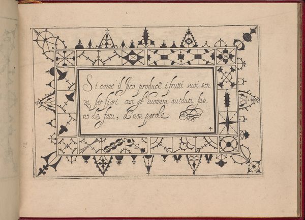
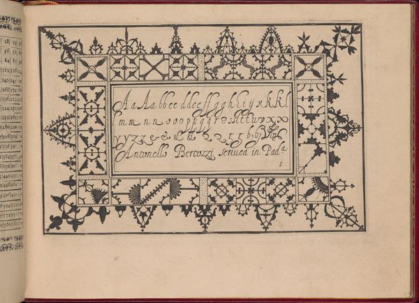
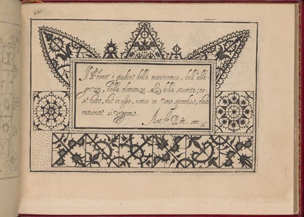
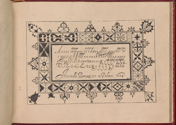
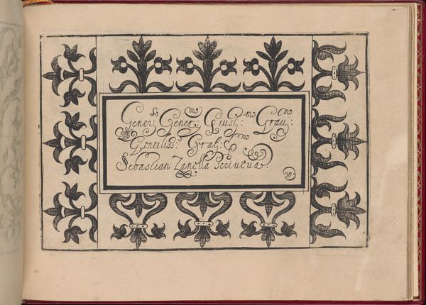
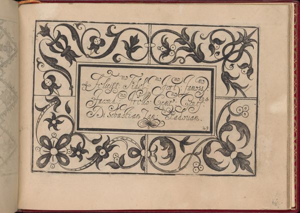
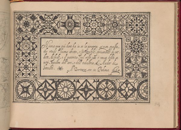
Ghirlanda: Di sei vaghi fiori scielti da piu famosi Giardini d'Italia, page 22 (recto) 1604
0:00
0:00
drawing, graphic-art, ornament, print, paper, ink
#
drawing
#
graphic-art
#
ornament
#
toned paper
# print
#
book
#
paper
#
11_renaissance
#
ink
#
italian-renaissance
#
calligraphy
Dimensions: Overall: 5 7/8 x 7 7/8 in. (15 x 20 cm)
Copyright: Public Domain
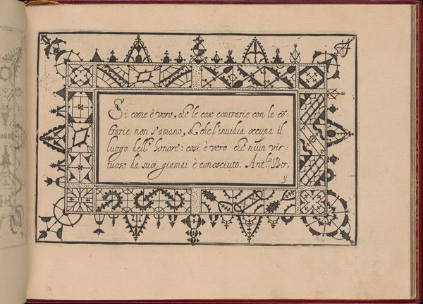
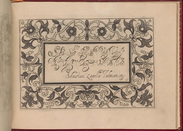
Editor: This is a page, specifically page 22, from *Ghirlanda: Di sei vaghi fiori scielti da piu famosi Giardini d'Italia* by Pietro Paulo Tozzi, created in 1604. It's an ink drawing on paper. What immediately strikes me is the elaborate border; it seems almost lace-like, contrasting with the stark alphabet in the center. What do you make of the composition? Curator: The page offers a fascinating interplay between structure and ornamentation. Note how the central rectangle, containing the alphabet, functions as an anchor. The floral and geometric patterns, meticulously rendered in ink, create a dynamic yet balanced frame. Consider the tension between the rigidity of the grid-like lower border and the more fluid, organic forms above. Editor: It’s interesting how the borders command your attention before the lettering does. Is that intentional, do you think? Curator: Quite possibly. The borders, through their complex patterns and textures, demonstrate a virtuosity in draftsmanship. Examine the delicate use of line and the repetition of motifs. They aren’t merely decorative; they establish a rhythm, a visual cadence. Is the lettering truly separated from the patterns? Are they informing each other in some fundamental manner? Editor: Now that you mention it, the flourishing calligraphy in the inscription below mirrors some of the border's curvilinear elements. There's a connection between the two that I hadn't initially noticed. Curator: Precisely. And how does the use of toned paper contribute to our understanding of the piece’s spatial depth, to the sense that some of the lettering almost fades away and rises again? Editor: It gives the drawing a certain warmth and age, definitely affecting the contrast and texture. I had focused too much on the clear boundaries between script and decoration. Thanks, this gives me a completely new framework for reading the drawing! Curator: Indeed. The value is seeing that ornamentation, typography, texture and shape can exist together dynamically, challenging our assumptions about utility and artistry.
Comments
No comments
Be the first to comment and join the conversation on the ultimate creative platform.
More like this