graphic-art, print, etching, paper, typography
#
graphic-art
#
dutch-golden-age
# print
#
etching
#
paper
#
typography
#
line
Dimensions: height 170 mm, width 225 mm, height 170 mm, width 420 mm
Copyright: Rijks Museum: Open Domain
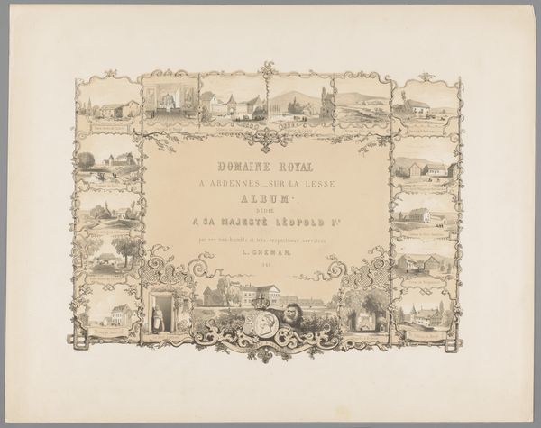
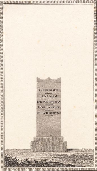
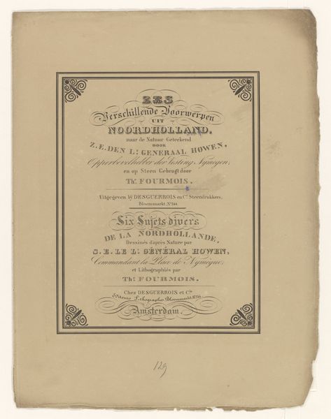
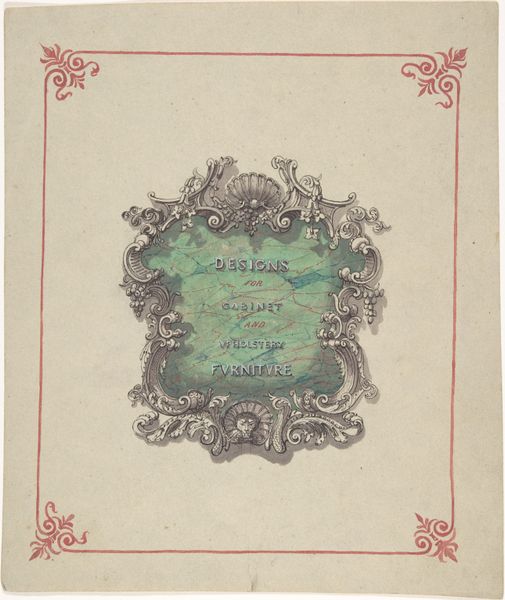
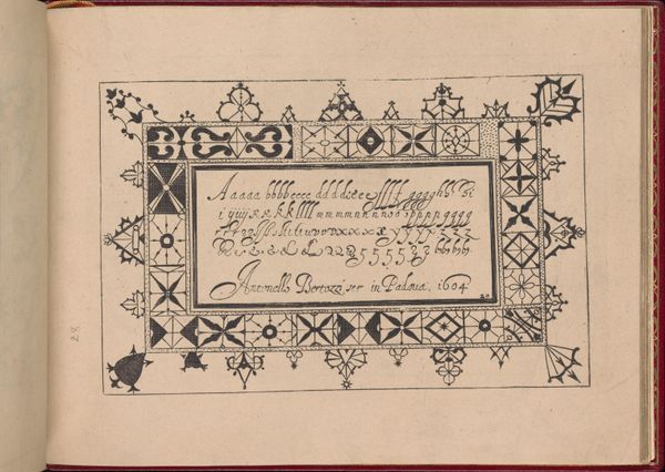
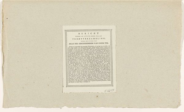
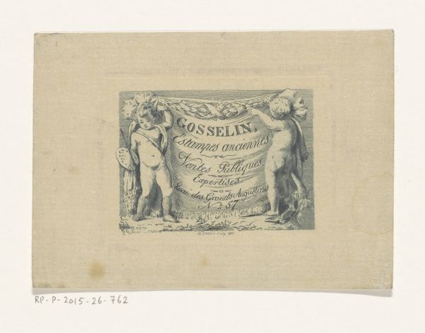
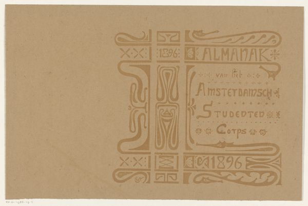
Curator: What a subtly powerful piece. We’re looking at the “Omslag voor De Teekenkunst gemakkelijk gemaakt,” or "Cover for Drawing Made Easy," dating roughly from 1819 to 1837. It’s currently held in the Rijksmuseum collection. It’s an etching on paper, and while the creator is anonymous, the work offers insight into accessible art education. Editor: My first impression is one of delicate simplicity. It’s visually quite sparse, but also somehow invites closer scrutiny. The color of the paper really conveys the antiquity of the item. Curator: Exactly. The typography and central image speak volumes about the period's aspirations. "Drawing Made Easy" implies a democratizing approach to art. Notice how the small image of the branch conveys naturalism as well. This idea echoes within the Dutch Golden Age tradition and points to a philosophy of imitation, where capturing the world around us became important. Editor: I'm intrigued by the title itself. "Drawing Made Easy" suggests a level of accessibility which contrasts with art education of that time that was only available to wealthy people, the ones that commissioned and purchased it. Who exactly did they have in mind for art education? It would be nice to consider the impact and inclusivity of these accessible art guides within different social classes. Curator: A valid question! It speaks directly to societal values embedded within artistic endeavors. Perhaps this suggests a shifting class structure? A desire among those commissioning the guides for something resembling 'progress'? Or it could be as simple as trying to cultivate amateur art consumers. It is clear how symbolism, here, reveals cultural memory. Editor: That’s possible. Looking closer at the design elements, it almost feels deliberately unrefined. I would hypothesize this choice attempts to create a more accessible and inviting learning tool, as you were describing. Curator: An intriguing connection, the raw state suggesting the unfinished art that this book may assist with. From an iconographical lens, this cover signals education but it is clear that much interpretation relies on who could access these drawings at the time. Editor: Yes, definitely. The nuances around gender, economic status, and even ableism remain an essential consideration in approaching this cover's narrative. Overall it pushes one to contemplate themes regarding equality and representation. Curator: Absolutely. An enlightening encounter—thank you for helping to reframe its implications on modern art studies. Editor: The pleasure was all mine. A cover's power lying in its open-ended dialogue with both past and present audiences.
Comments
No comments
Be the first to comment and join the conversation on the ultimate creative platform.
