print, photography, gelatin-silver-print
#
portrait
#
script typeface
#
aged paper
#
homemade paper
#
script typography
# print
#
hand drawn type
#
photography
#
fading type
#
stylized text
#
gelatin-silver-print
#
thick font
#
golden font
#
historical font
Dimensions: height 104 mm, width 63 mm
Copyright: Rijks Museum: Open Domain
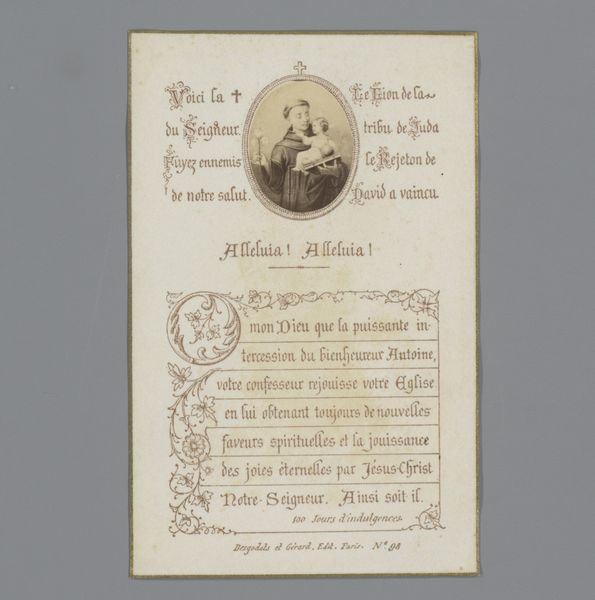
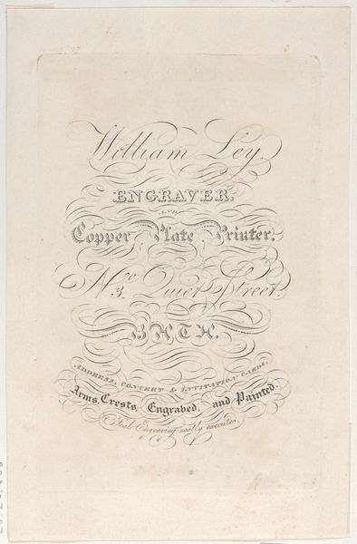
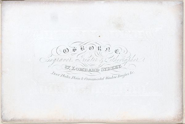
Curator: Here at the Rijksmuseum, we have an intriguing gelatin-silver print from the late 19th century, created sometime between 1880 and 1887. It's titled "Portret van een onbekende man"—Portrait of an Unknown Man. Editor: There’s an almost unsettling anonymity to this work. The deliberate obfuscation of identity and, let’s face it, it's just the verso! But there is still such considered design, balanced by a pleasing disorder. The lettering really sings. Curator: Indeed. This particular kind of photography served a very specific societal need and speaks volumes about class and identity in that period. The photograph, by Sanders & Co., was taken in Groningen, which we can gather from the text which explains the prints remain in their possesion, indicating customers would have needed to re-order should they wish. These sorts of portrait prints allowed a democratisation of likeness in the nineteenth century. Editor: It's curious, isn't it, how even the reverse is filled with typography, almost competing for our attention with the forgotten sitter! The faded script lends a textural quality, echoing the passage of time, becoming almost sculptural against the backdrop of aged paper. I wonder, was the paper stock standard, or might it vary by photographer? Curator: Most likely a standard practice given these were mass produced to certain standards and sold from commercial establishments like Sanders & Co. The choice of thick font further suggests the stylistic conventions that prevailed in the period and indicates their marketing choices - I wonder how many others they may have taken, how many different designs? The typography evokes a very strong memory – from anthropology, it speaks about the necessity of the object for the rituals around family and commemoration of relatives. Editor: What strikes me most is the overall composition; the diagonal arrangement creates dynamism, contrasting against the otherwise static nature of portraiture as it existed during the end of the 19th century. Even in this reverse composition of textual elements there's careful counter positioning. This is further echoed in other prints created using this method. I suspect their photographic archive could create whole sociological picture! Curator: Exactly. These portraits represent both the individuals in frame but allude to broader social customs in European communities. They tell more than the story they capture. Editor: It goes beyond mere documentation, as this particular artefact indicates – this piece feels more than just the sum of its physical properties. It suggests to me that its symbolism makes it more. Curator: An idea I would most certainly agree with. Thank you.
Comments
No comments
Be the first to comment and join the conversation on the ultimate creative platform.
More like this