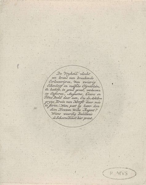
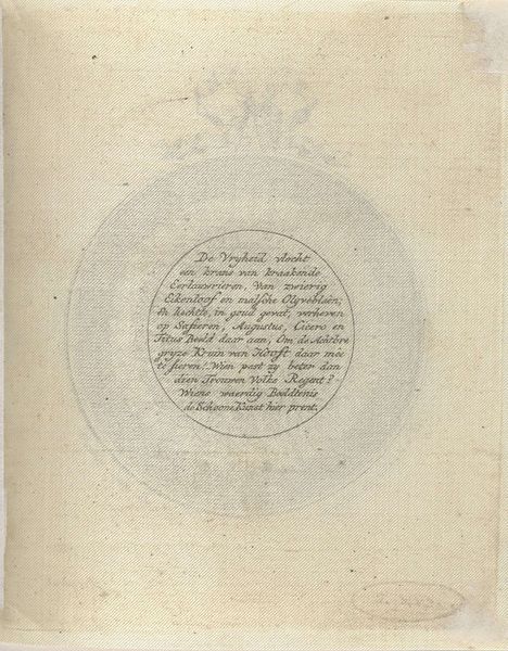
drawing, print, paper, ink, engraving
#
portrait
#
drawing
#
neoclacissism
# print
#
paper
#
ink
#
history-painting
#
engraving
Dimensions: height 59 mm, width 119 mm
Copyright: Rijks Museum: Open Domain
Editor: So, this is “Gedenkpenning op Hendrik Danielsz. Hooft, 1787” by an anonymous artist. It’s a print – ink on paper. What first strikes me is its almost mathematical feel; everything’s carefully arranged, circular. What catches your eye when you look at this, besides all that intriguing old Dutch text? Curator: You know, it’s fascinating how something so seemingly straightforward as a commemorative medal can be a portal to an entire era. Neoclassicism valued order, reason, and clarity, and this print really embodies that spirit. It’s interesting how the inscription itself becomes part of the visual experience. Editor: Absolutely! I’m curious about the text itself. Does the lettering style contribute anything to the overall feeling? Curator: Good question. The lettering style in these medallions does several things. The neat, precise font emphasizes the importance of language during the historical era. It really does highlight Neoclassicism as the typography has qualities from ancient Greek or Rome lettering which connects to that time periods art and politics. Editor: It sounds like it was more than just a simple portrait. It's cool how much you can read into just the typeface and composition of the overall artwork. Curator: Yes! It prompts us to reconsider the artistic and historical context through careful attention. I now perceive this to be quite more interesting now that you made the initial interpretation!
Comments
No comments
Be the first to comment and join the conversation on the ultimate creative platform.
More like this