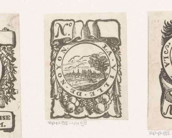
print, engraving
#
baroque
# print
#
decorative-art
#
engraving
Dimensions: height 71 mm, width 62 mm
Copyright: Rijks Museum: Open Domain
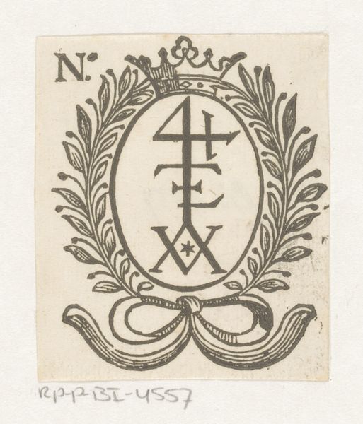
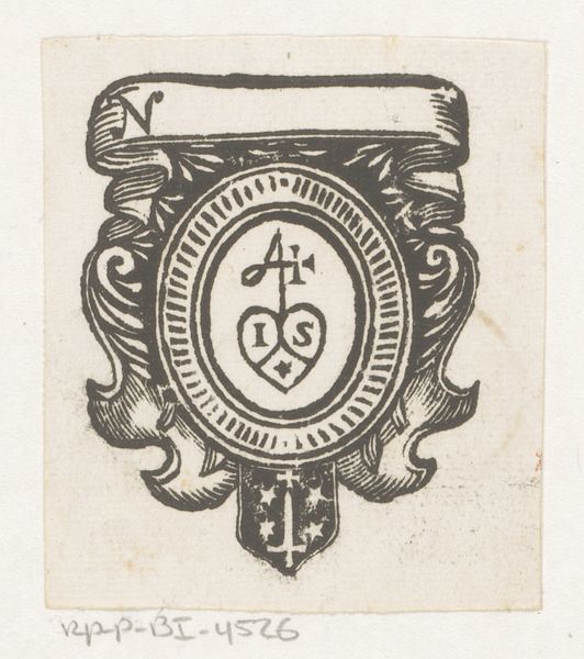
Curator: Well, here we have "Vignet met een monogram en twee putti," or "Vignette with a monogram and two putti" in English, a charming little engraving from the 17th century, attributed to an anonymous artist. What are your initial thoughts? Editor: Tiny, but kinda potent, you know? All these flourishes, the chubby putti... It feels like distilled Baroque grandeur in this teensy package. Is that intentional, I wonder? Curator: Most certainly. Vignettes like this served specific purposes. Monograms themselves are intriguing—visual abbreviations holding personal or familial weight. And the putti... ubiquitous in Baroque art. Why do you suppose they became so popular? Editor: Innocence, right? Some kind of unburdened ideal—a cherubic blank slate on which to project aspirations. They are also unsettling. What business do grown ups have crafting so many cute baby figures? Curator: It’s complex. The "putto" figure dates all the way back to classical antiquity and represented pagan concepts of love and divine inspiration. By the Baroque period, that association was consciously adapted for Christian usage. Think of them as allegories. Editor: Oh, right, to make heavy religious messages palatable with adorable imagery. "Look at the cute angel… contemplate redemption." See, unsettling. Curator: Haha, perhaps, but look closer at how they're placed. Framing the monogram— almost guarding it. Then consider the phrase below— "Fabrika Perfectissima." Is this celebrating perfection, a company, maybe even God's perfect creation? These cherubs aren’t simply decorative; they're actively reinforcing a message of quality. Editor: Like brand ambassadors for the divine, these original influencers. Okay, I kinda see it now. It's this compressed symbolism. You could spend hours decoding all the visual cues. A bit overwhelming, but also brilliant. It looks light and simple and decorative but the iconography is as concentrated and serious as an Old Master oil painting. Curator: Exactly. And within the cultural context, these symbols speak to a widely understood visual vocabulary. Editor: Makes you wonder about the things our visual shortcuts say about us, right? Like, what would future art historians make of our emojis? Anyway, I will look at Baroque art and marketing a bit differently going forward, it seems. Curator: As will I, and how powerful a small format like this can be. It leaves you something to reflect on.
Comments
No comments
Be the first to comment and join the conversation on the ultimate creative platform.
More like this