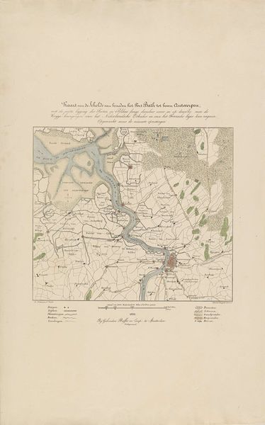
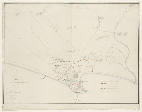
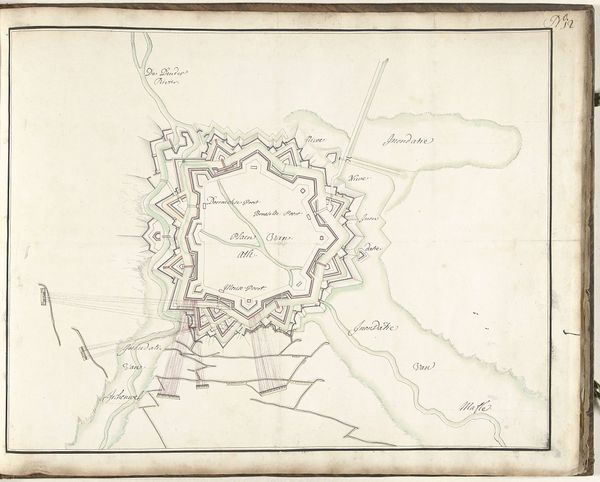
Kaart van de Schelde met de posities van de Nederlandse oorlogsschepen, 1831 1832
0:00
0:00
willemcornelisvanbaarsel
Rijksmuseum
#
aged paper
#
personal sketchbook
#
ink drawing experimentation
#
pen-ink sketch
#
pen work
#
sketchbook drawing
#
watercolour illustration
#
storyboard and sketchbook work
#
sketchbook art
#
watercolor
Dimensions: height 483 mm, width 670 mm
Copyright: Rijks Museum: Open Domain
Editor: Here we have "Kaart van de Schelde met de posities van de Nederlandse oorlogsschepen, 1831," created in 1832. It’s attributed to Willem Cornelis van Baarsel. Looking at it, I immediately get a sense of… deliberate precision, like someone planning a very important game. It's all in watercolor and ink. How do you interpret this work? Curator: A map is never just a map, is it? It’s a coded story. Notice how the positions of the Dutch warships are meticulously noted, and consider the psychological weight that such a precise rendering carries. This isn’t just about navigation; it’s about power, control, and the strategic visualization of dominance. How does the rendering of Antwerp itself strike you, given its bright coloration? Editor: Antwerp seems so…contained, almost aggressively so with that heavy outline. The red makes it look less like a city and more like a military target. Curator: Precisely. Color amplifies the symbolic intention here. Red, culturally, often represents conflict, blood, urgency. Its placement speaks volumes about the perceived vulnerability and strategic importance of Antwerp in the context of these naval deployments. Do you think the detail given to the surrounding areas is also trying to say something? Editor: Maybe… there's a stark contrast, with those areas appearing much calmer, more agrarian. Almost as if to say, "Here is what we are defending." So the image functions beyond just documenting geography – it's presenting a particular narrative, loaded with strategic and even emotional intent. Curator: Exactly. Each mark, each color choice contributes to a larger, deliberately constructed message of national strength and territorial claim. The map becomes a visual assertion of Dutch maritime power, carefully crafted to influence perception, both internally and externally. Editor: That reframes my whole perspective. It’s fascinating to see how symbols work on so many levels. Curator: Indeed. The emotional, the strategic, the territorial – they're all interwoven. Understanding this allows us to decipher the rich cultural code embedded within even seemingly straightforward cartography.
Comments
No comments
Be the first to comment and join the conversation on the ultimate creative platform.
More like this