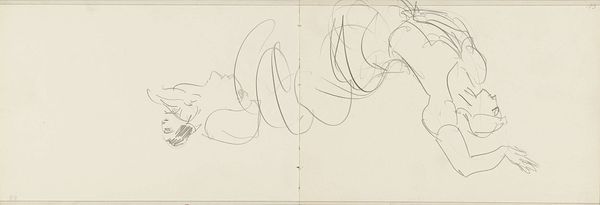
drawing, paper, ink
#
word art style
#
drawing
#
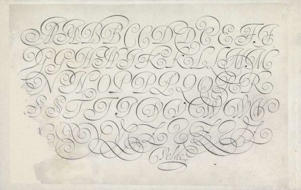
script typography
#
hand-lettering
#
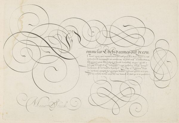
baroque
#
lettering
#
hand drawn type
#
hand lettering
#
paper
#
word art
#
ink
#
hand-drawn typeface
#
typography style
#
calligraphy
#
small lettering
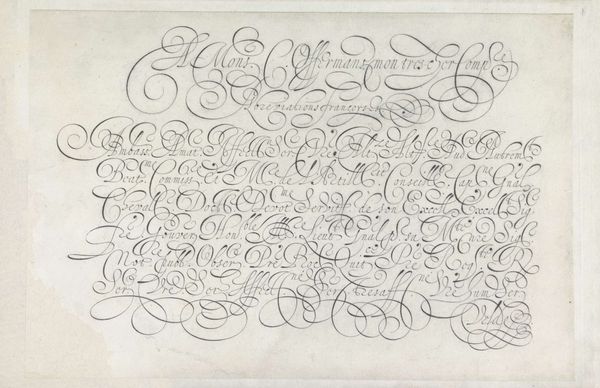
Dimensions: height 203 mm, width 320 mm
Copyright: Rijks Museum: Open Domain
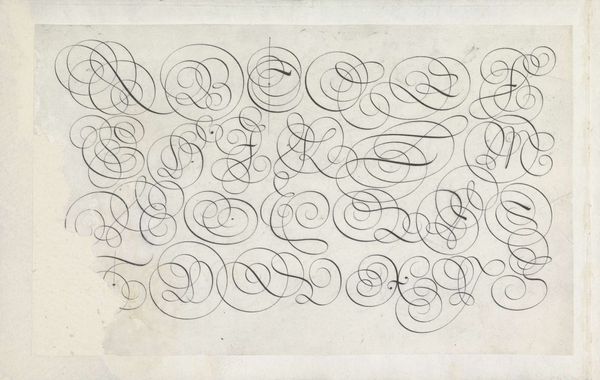
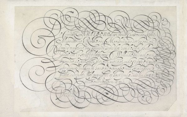
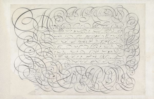
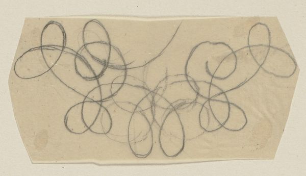
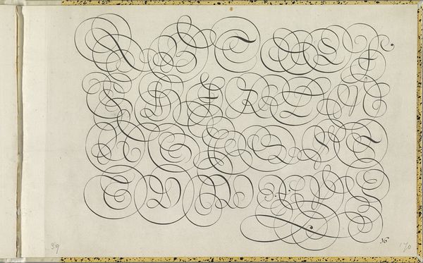
Curator: Just looking at it, I immediately get a sense of almost frantic energy, like a bird that's been let loose in a very small room. Editor: Here we have "Ontwerp van een schrijfvoorbeeld: Vive la plume," or "Design of a Writing Example: Long Live the Pen," a drawing in ink on paper by Jan van de Velde I, created around 1605. It’s currently held here at the Rijksmuseum. Curator: "Vive la plume"—what a perfectly flamboyant title. Given that it’s meant as an example, you have to wonder about the labor and skill required to produce something like this with such precision, the physical effort! It also strikes me as something decorative more than functional. Editor: Well, consider the historical context. Calligraphy at this time was deeply connected to status. Beautiful script signaled education and refinement. This drawing offered instruction but it also performed as a demonstration of artistry, both in terms of penmanship and pure design. It had to reflect well on the artist! Curator: Right. The paper itself – the type and availability would have heavily impacted how the materials were valued and seen at the time. It is fascinating to see paper with damages and imperfections survive. You immediately wonder who was able to buy and interact with paper then. Editor: Exactly. We're viewing it in a museum today, but originally it would have circulated within a much smaller, likely elite, group, perhaps as a teaching tool, perhaps as an advertisement of Van de Velde's skills. Now, of course, the drawing circulates freely for our public consumption and judgment. It really speaks to the political power of the pen, doesn't it? A celebration of the potential of writing and those who can use it. Curator: It certainly puts the "font selection" on my laptop into a different light! Thinking about the work involved helps me reconsider our assumptions. Editor: I agree. It shows how presentation, then and now, always plays a social role, doesn’t it?
Comments
No comments
Be the first to comment and join the conversation on the ultimate creative platform.
More like this