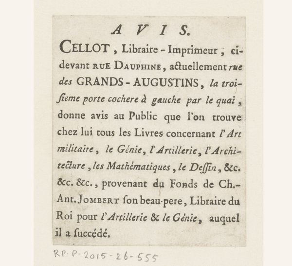
Visitekaartje van Labalte fils, uitgeverij en verkoper van kantoorartikelen te Chartres Possibly 1817
print, textile, typography, poster
aged paper
script typography
hand drawn type
hand lettering
textile
typography
fading type
stylized text
thick font
handwritten font
golden font
poster
historical font
Dimensions: height 78 mm, width 153 mm
Copyright: Rijks Museum: Open Domain
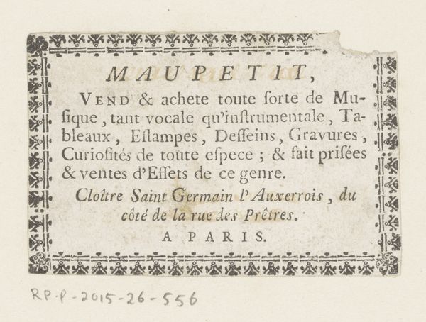
Curator: This piece, potentially from 1817, is a calling card for Labalte fils, a printer and vendor of office supplies in Chartres. It's primarily print on, likely, paper. Editor: My first impression is of constrained elegance. The density of text bordered by that delicate floral design creates a curious visual tension, almost claustrophobic yet refined. Curator: Indeed. Note the typography, the considered arrangement of typefaces within such a small frame. It showcases the printer’s craft and aims, using fonts to structure a visual hierarchy within the advertisement. The stylistic use of fonts signifies class distinctions to target particular clients. Editor: That dense text certainly speaks volumes. Consider the cultural landscape; this isn't just about selling paper and ink. The long list of goods— from fine papers to wax for sealing letters, slates, drawing supplies, to playing cards, decorated boxes and screens suggests a burgeoning culture of correspondence and leisure. It really shows who had access to certain commodities, especially as this business was located in France after the French Revolution and the Napoleonic Era. Curator: Precisely! It’s interesting to analyze it beyond just a commercial document, but how design and typography shape a viewer's reception of a printer's wares, and communicate the Labalte fils brand identity. Even now, it feels complete—unified by consistent visual cues like the kerning of letters, or, more obviously, the symmetric visual impact across the X and Y axes of the composition. Editor: And let’s not forget the "etc. etc." It speaks to the potentially limitless nature of commerce. While also telling us what the company sold, it gives insight into the day to day functions of that business’ clientele and the community around it. It makes you wonder: who held this card, what did they purchase? Curator: I agree; viewing such ephemera enriches the historical tapestry, allowing us insights beyond formal aesthetics. Editor: Absolutely. Studying the piece structurally provides key context for grasping Labalte’s historical significance as more than just a calling card, but as a material representation of French society in the 19th century.
Comments
No comments
Be the first to comment and join the conversation on the ultimate creative platform.
