graphic-art, print, typography
#
graphic-art
#
script typography
#
hand-lettering
#
baroque
# print
#
hand drawn type
#
hand lettering
#
typography
#
hand-drawn typeface
#
fading type
#
stylized text
#
thick font
#
handwritten font
#
small lettering
Dimensions: height 281 mm, width 380 mm
Copyright: Rijks Museum: Open Domain
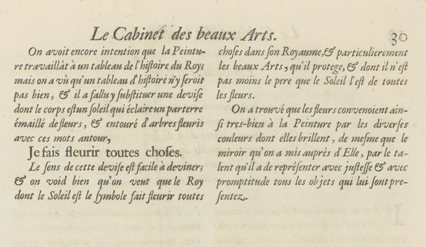
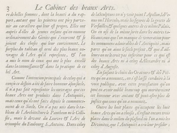
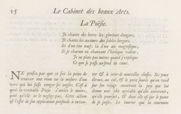
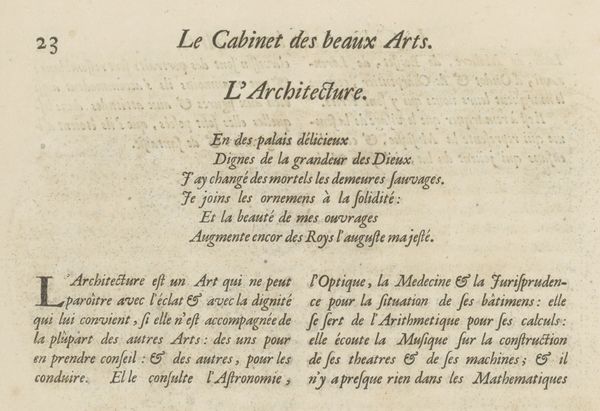
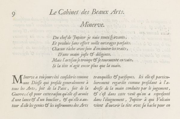
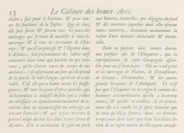
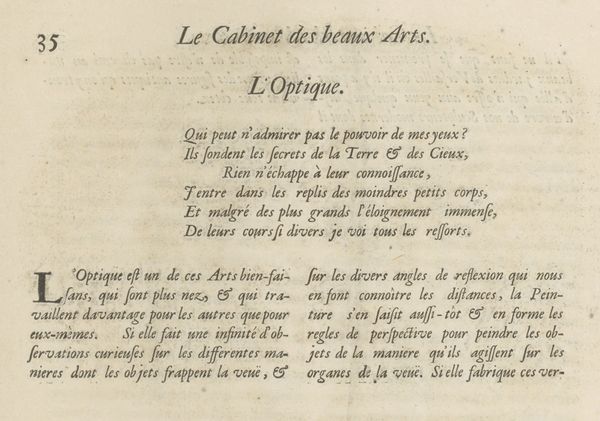
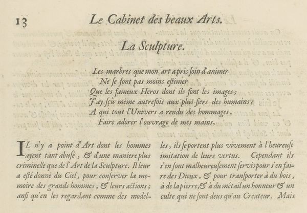
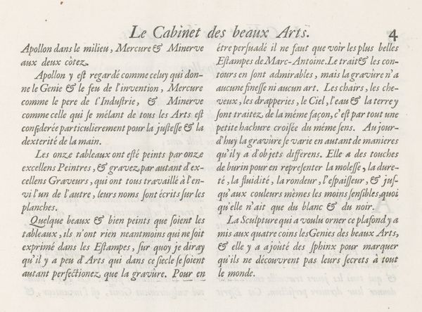
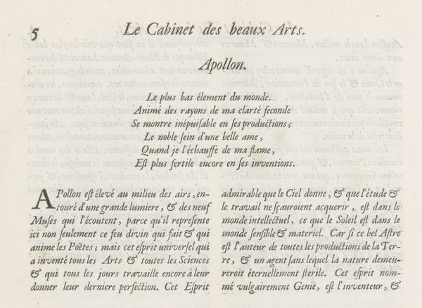
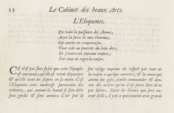
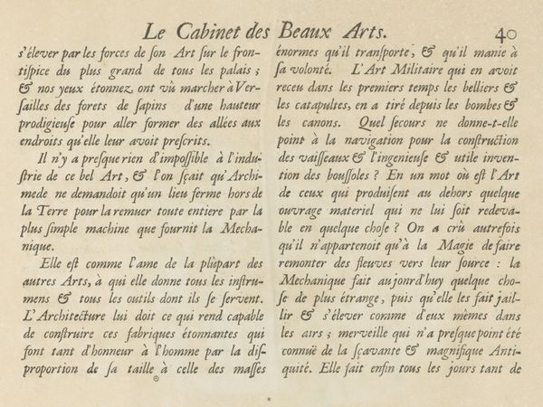
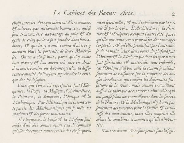
Editor: Here we have "Tekstblad met verklaring van de prent over Architectuur, p. 26," a print from 1695 by Charles Perrault. It appears to be a page of descriptive text. I find the overall design to be somewhat crowded. What are your observations about this particular printed page? Curator: The formal elements are paramount. Observe the meticulous arrangement of the text, the intentional leading between the lines, and the carefully chosen typeface. How do these contribute to the overall reading experience? Editor: Well, I notice the letterforms themselves have a certain weight and presence. The serifs are quite pronounced. Is there any hierarchy created through changes in font size or style? Curator: Precisely! Examine the shifts in scale and weight. Notice the capitalization and italics are deployed to create a visual rhythm and subtly guide the reader’s eye, emphasizing key concepts and names within the block of text. Consider, also, the materiality of the print itself. What inferences might we draw from its likely texture, the ink, the paper? Editor: I hadn’t considered that. So, rather than thinking about the content of the text, we can appreciate it as a study in contrasts of light and dark, thick and thin? Is that accurate? Curator: Exactly. While content cannot be dismissed entirely, understanding how form communicates independently— through line, shape, and texture—deepens our appreciation for the design itself. Does seeing it this way give you a fresh outlook? Editor: It absolutely does! It moves it beyond just "something to read" to "something to see" in a whole new way. Thanks.
Comments
No comments
Be the first to comment and join the conversation on the ultimate creative platform.
