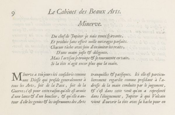
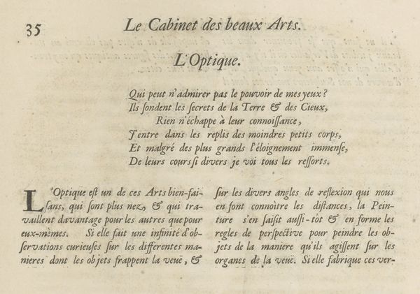
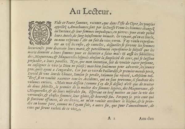
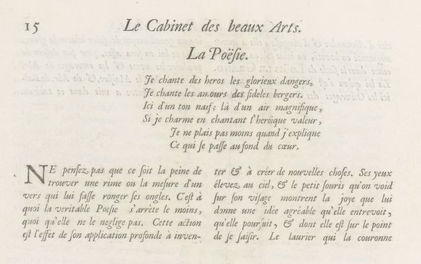
graphic-art, print, typography
#
graphic-art
#
baroque
# print
#
typography
Dimensions: height 281 mm, width 380 mm
Copyright: Rijks Museum: Open Domain
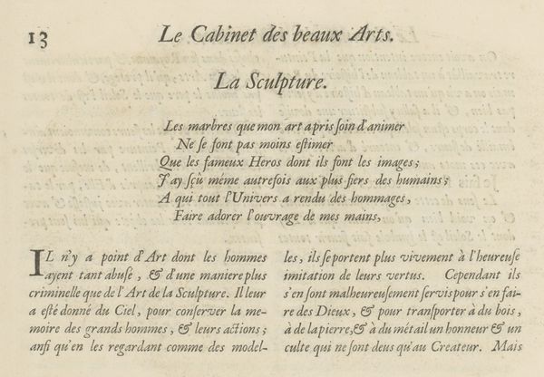
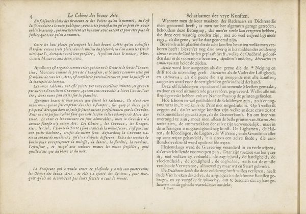
Curator: This is a text sheet from 1695, bearing the title "Tekstblad met verklaring van de prent over Schilderkunst, p. 30," or "Text Sheet with Explanation of the Print on Painting, p. 30," associated with Charles Perrault. It's a rather dense example of baroque typography, isn’t it? Editor: Dense is one word for it. It feels overtly rhetorical; even without understanding the French, I sense it’s a statement on power, specifically tied to artistic representation. Curator: Precisely. It's explaining a visual allegory involving the King, represented by the sun, making all things in his kingdom, particularly the fine arts, flourish. The very means of its production – printmaking, typography – speaks to a broader system of disseminating such royalist ideology. Editor: Absolutely. It’s using the relatively new technology of print to reinforce the King’s control. I can imagine how this narrative worked to establish dominance: who is represented and what imagery became enmeshed within constructions of gendered identity during Louis XIV’s reign. It’s all there in this carefully printed proclamation, as part of the process by which Louis used art to further bolster his absolute power. The "fleurir toutes choses" bit rings pretty hollow when considered with some awareness to workers creating art by decree. Curator: Well, in its design, it does emphasize craftsmanship. The detail and deliberation apparent in the selection and arrangements of type… that took real skill and material resources to execute, right? It draws on printmaking as a tool but equally affirms the artisan labor behind each line and flourish, even while those elements become political statements, too. It’s more complex than simple propaganda. Editor: Maybe… or it serves as propaganda through aestheticizing and normalizing labor and domination. This "skill" on the printer's part could, viewed critically, obfuscate class disparities and power structures reinforced by monarchical decree, turning oppression into elegant artistry. Curator: A bit cynical, but a fair challenge! Still, examining such pieces – not just for iconographic content but how such imagery was distributed via print – reminds us to look critically at material culture. It also highlights artistic production within systems of power… both historically and in the present day. Editor: Exactly, looking beneath what has literally been printed here reveals so much about intersectional layers of history, art, and the politics that shaped Baroque visual culture.
Comments
No comments
Be the first to comment and join the conversation on the ultimate creative platform.
More like this