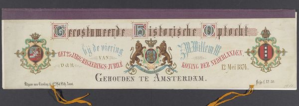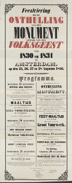
Historische gekostumeerde optocht te Amsterdam bij het 25-jarige regeringsjubileum van koning Willem III in 1874 (omslag) 1874
0:00
0:00
graphic-art, print, typography, poster
#
graphic-art
#
hand-lettering
# print
#
hand drawn type
#
hand lettering
#
typography
#
hand-written
#
hand-drawn typeface
#
fading type
#
stylized text
#
thick font
#
handwritten font
#
decorative-art
#
poster
#
realism
#
small lettering
Dimensions: height 117 mm, width 371 mm
Copyright: Rijks Museum: Open Domain
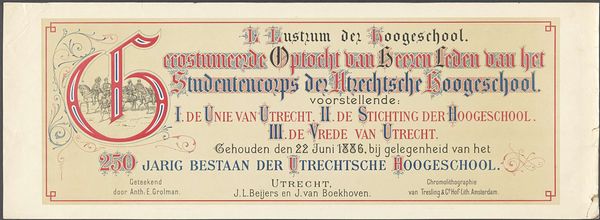
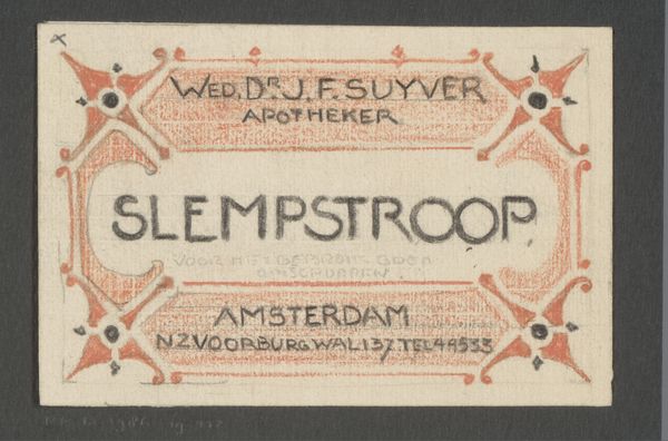
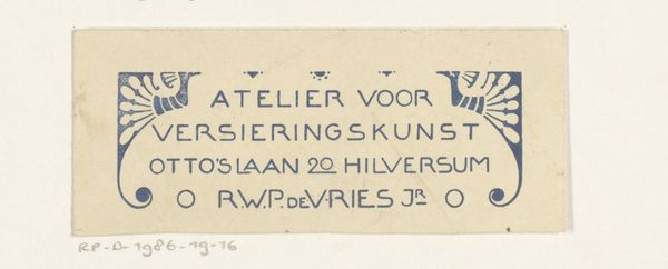
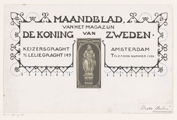
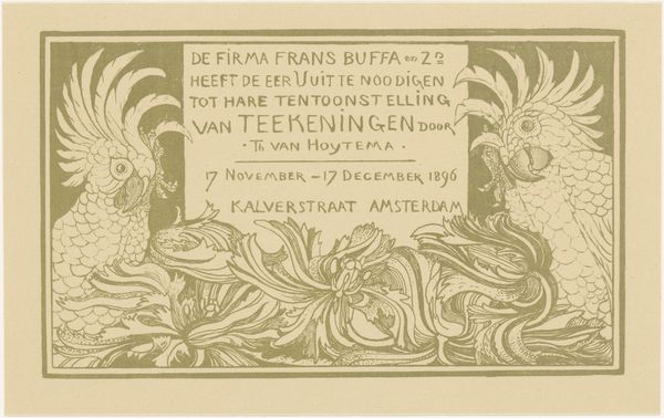
Editor: Here we have a print from 1874, "Historische gekostumeerde optocht te Amsterdam bij het 25-jarige regeringsjubileum van koning Willem III", created by Gebroeders Binger. It’s basically an announcement poster, and I’m immediately struck by how ornate the lettering is! What stands out to you in this piece? Curator: Ah, yes, a real typographic time capsule! You know, this isn’t just about conveying information, it’s about creating a feeling. The font they used, almost gothic, speaks to a sense of tradition and history. Look at how each letter is crafted. They weren’t just setting words, they were drawing them, breathing life into each curve and flourish. It whispers of a time when announcements weren't just scrolled past on a screen, but were events in themselves. Do you feel the weight of that history too? Editor: I definitely see what you mean about the weight of history, and how the lettering makes it feel grand, like a royal proclamation! The flourishes almost make it hard to read, though. Was that a common style then, prioritizing decoration over clarity? Curator: It’s a dance, isn't it, between legibility and artistry. Remember, this was a culture steeped in symbolism and visual cues. The decorative elements signaled importance, almost like visual punctuation emphasizing the significance of the event. And maybe a little difficulty to read also made people slow down, pay attention. Editor: That’s a really interesting point! I hadn't thought about slowing down as a deliberate choice. Curator: It makes you wonder about our own design choices today, doesn’t it? What are we sacrificing in the name of speed and efficiency? Editor: Absolutely, it makes you appreciate the craftsmanship and intentionality of something like this poster even more. Thanks for pointing that out.
Comments
No comments
Be the first to comment and join the conversation on the ultimate creative platform.
