print, typography, engraving
#
portrait
#
neoclacissism
# print
#
typography
#
history-painting
#
engraving
Dimensions: height 280 mm, width 218 mm
Copyright: Rijks Museum: Open Domain
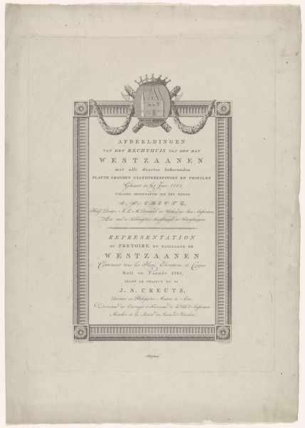
Curator: This typographic print, titled "Tekstblad bij het portret van Egbert de Vrij Temminck," created by Jacob Houbraken in 1781, commemorates a notable figure in Amsterdam’s history. I see that you are admiring it... What catches your eye? Editor: The sheer weight of the text—it's almost oppressive! It's as though the words themselves are trying to embody the importance of the man it describes. There’s something almost somber about its density. Curator: It certainly isn't light and airy. What strikes me is its dedication to Neoclassical principles; very austere, the design serves to memorialize the subject with sobriety and gravity, wouldn't you agree? Editor: I see it! The formality is undeniable; the very structured layout reminds one of Roman inscriptions on a monument. It emphasizes reason and order—classic traits we find reflected throughout the Neoclassical art movement. I wonder, though, about accessibility; does all this verbiage make him more or less approachable, do you think? Curator: That’s a pertinent point. While seemingly reverent, these qualities actually remove a certain relatability from the subject. Instead of feeling connected, the viewer feels as if the goal is veneration. Editor: It feels almost…performative in its grief and awe. More a pronouncement than an invitation, wouldn't you agree? Despite its limitations in warmth, this technique does create a kind of stoic tribute befitting its Neoclassical style! Curator: True. Houbraken, in his deliberate orchestration of letters and lines, has encapsulated a historical moment within a visually commanding artifact. I think it asks us to reconsider our own definitions of "portraiture"; can an individual be captured via prose and design? Editor: And can such calculated, artful pronouncements, such careful placement of prose on the page ever deliver the same impact as a canvas exploding with unbridled emotion? Food for thought!
Comments
No comments
Be the first to comment and join the conversation on the ultimate creative platform.
More like this