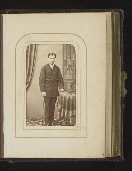
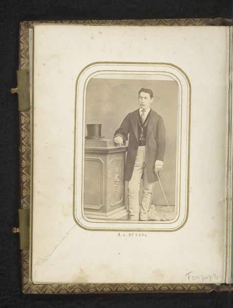
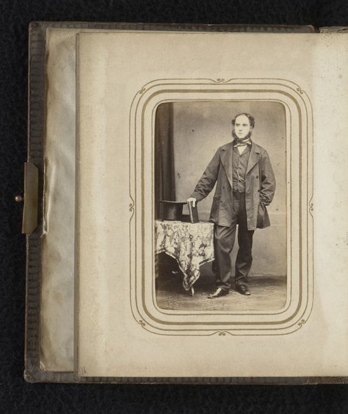
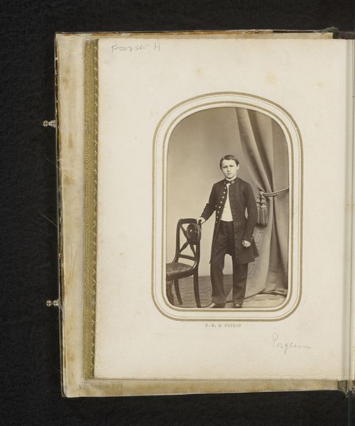
Portret van een jonge man met pet in de hand, staand bij een stoel 1868 - 1870
0:00
0:00
photography, gelatin-silver-print
#
portrait
#
photography
#
gelatin-silver-print
#
genre-painting
Dimensions: height 84 mm, width 52 mm
Copyright: Rijks Museum: Open Domain
Editor: We're looking at "Portret van een jonge man met pet in de hand, staand bij een stoel," a gelatin-silver print from between 1868 and 1870, by S. van Caspel & Stapert. The young man looks self-assured but somewhat melancholic. How do you interpret this work through its visual elements? Curator: The portrait adheres to a very deliberate structure. Note the carefully controlled light and shadow—observe how the tonality is quite even to avoid the creation of deep contrast, so to subtly enhance the volume and contour of the subject. Consider how this photograph captures the materiality of 19th-century attire, contrasting textures such as tweed-like coat and the softer drape of what we can imagine is velvet. Note how all elements enhance this subject through its precise structure. What visual cues draw your attention? Editor: I’m intrigued by his casual pose, leaning against the chair. The composition directs our eyes towards him, yet his expression seems distant, maybe weary. Do you see any contrast at work, visually? Curator: The image leverages a balance through opposition. The straight lines of the studio architecture—the chair and wall trim—offer formal geometry, offset against the human element’s curves and soft attire. It’s a subtle arrangement, carefully studied to convey both stature and accessibility of this subject. It's designed to reveal only the subject. The background then operates as mere support, and remains entirely flat. The tonality of background flattens even further the intended perception. Note its role of neutral support. What is it about it that you find more telling? Editor: I didn't see that before. I see how these careful choices enhance a more powerful effect. Curator: The composition directs our reading of it through visual language to an enhanced state. I found this quite insightful.
Comments
No comments
Be the first to comment and join the conversation on the ultimate creative platform.
More like this