drawing, graphic-art, print, ink, engraving
#
pen and ink
#
drawing
#
graphic-art
#
baroque
#
pen drawing
# print
#
pen illustration
#
pen sketch
#
old engraving style
#
ink
#
pen-ink sketch
#
line
#
pen work
#
cityscape
#
engraving
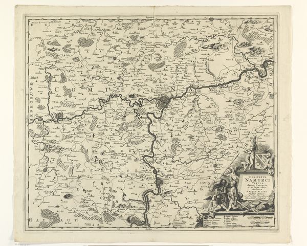
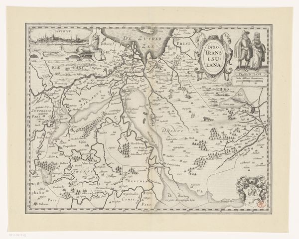
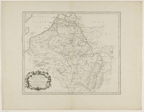
Dimensions: height 154 mm, width 226 mm
Copyright: Rijks Museum: Open Domain
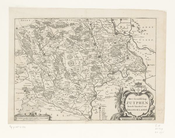
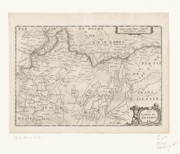
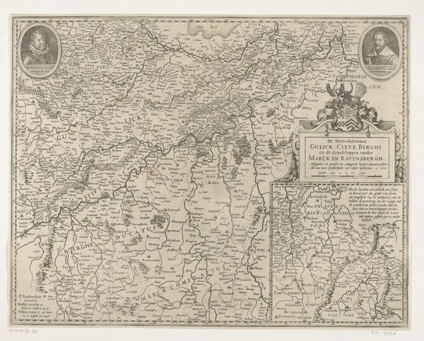
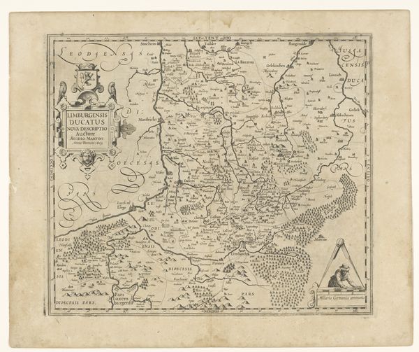
Curator: This is an interesting piece: an early map rendered with exquisite detail. "Kaart van het graafschap Namen," or "Map of the County of Namur," is the name; its precise date of creation hovers somewhere between 1635 and 1696. The artistry of the unknown author is apparent in its meticulous use of pen and ink. Editor: Intricate indeed! The network of lines sketching the topography gives the land a strangely energetic pulse. You can feel the rivers and paths breathing across the page, almost overwhelming the representational purpose of cartography. Curator: Quite so. The density of detail creates visual tension. Notice the varied line weights—thicker outlines defining political boundaries, finer strokes illustrating natural features, a calculated interplay which reveals much about Baroque sensibilities. Editor: It speaks volumes, doesn't it, about power and perception in that era. Mapping wasn't merely documentation, it was a means of asserting control. The "Comitatus Namurci" title cartouche flanked by angelic figures…pure ideological promotion. It’s about shaping perceptions of this territory for specific purposes. Curator: Undoubtedly. Though formally the design choices direct the viewer. Consider how the negative space draws one's eye towards the core territorial definition; the composition pushes this region forward through strategic arrangement of forms, reinforcing its primacy. Editor: I'd agree the emphasis given here elevates the map from functional record into a tool of statecraft. Think about how such images reinforced civic identities, legitimized territorial claims during tumultuous periods, shaping policies related to resources and jurisdictions of various sorts. Curator: Well, seeing past the historic uses and viewing the raw components helps appreciate how visual dynamics contribute to broader contextual appreciation here. Editor: The convergence of visual form and power, all neatly packaged. Gives you something to think about, that's for sure!
Comments
No comments
Be the first to comment and join the conversation on the ultimate creative platform.
More like this