print, engraving
#
portrait
#
baroque
#
pen drawing
# print
#
figuration
#
geometric
#
line
#
history-painting
#
engraving
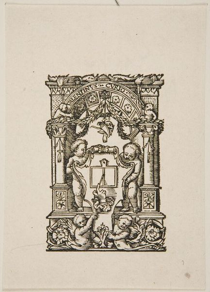
Dimensions: height 89 mm, width 48 mm
Copyright: Rijks Museum: Open Domain
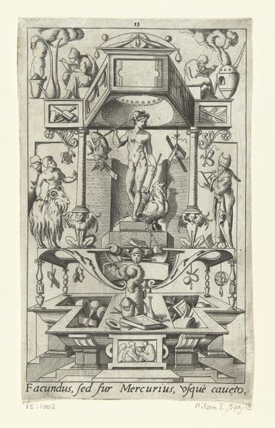
Curator: Welcome. We’re standing before "Ontwerp voor een titelpagina," or "Design for a Title Page," created by Pieter Serwouters. It's an engraving made sometime between 1601 and 1657, here at the Rijksmuseum. Editor: Oh, this has that formal yet playful feel, like a stern history lesson trying to loosen its tie. It's all these serious figures hemmed in by, what are those, garlands of fruit? Curator: Exactly. The combination of classicising figures and naturalistic details is a hallmark of Baroque title pages. See how Alexander the Great's portrait at the top is framed by fruit? It connects with ancient ideals but uses very current symbols of prosperity. Editor: It's kind of like history trying to dress up for a party, you know? Alexander the Great giving his best Blue Steel, surrounded by celebratory bounty...while those two figures flanking the title space look positively glum holding those flagpoles! Curator: They are allegorical figures that convey strength and virtue, intended to invite you into the narrative within the book it would introduce. Look how the artist used clean lines to bring out their strong, imposing presence. Editor: But there's also this dark undercurrent to the grandeur. Check out that grotesque mask under the figure on the left. It injects this moment of drama and ugliness amidst all the clean, precise lines. Does it hint at something deeper, something shadowed beneath all that power? Curator: Absolutely, masks were often utilized to invoke both Comedy and Tragedy. It creates visual complexity that draws the viewer into deeper investigation. Consider the context, too— this was a period of upheaval, the Eighty Years’ War. The need to project power, stability and heritage became pronounced through such images. Editor: Ah, a historical smokescreen, perhaps. Or at least a determined attempt to project something solid. I am reminded that underneath all those shiny apples, things can start to rot, even for great empires, maybe especially for them. Curator: Well, whether or not intended by the artist, that is an interesting perspective to reflect upon for ourselves in the present. I hope viewing this title page inspires further such thinking from our audience, connecting with our own contemporary symbols and representations. Editor: It's a fun little piece—inviting and just slightly unsettling—it certainly stirs the pot. Good for a browse.
Comments
No comments
Be the first to comment and join the conversation on the ultimate creative platform.
More like this