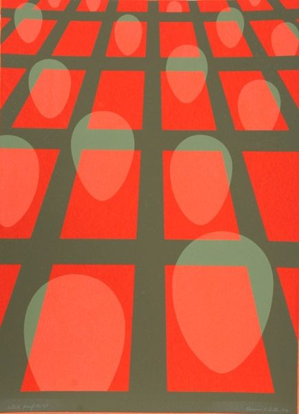
painting, acrylic-paint, ink
#
painting
#
pattern
#
colour-field-painting
#
acrylic-paint
#
geometric pattern
#
ink
#
abstract pattern
#
minimal pattern
#
geometric
#
abstraction
#
line
#
modernism
#
hard-edge-painting
Copyright: Thomas Downing,Fair Use
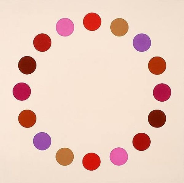
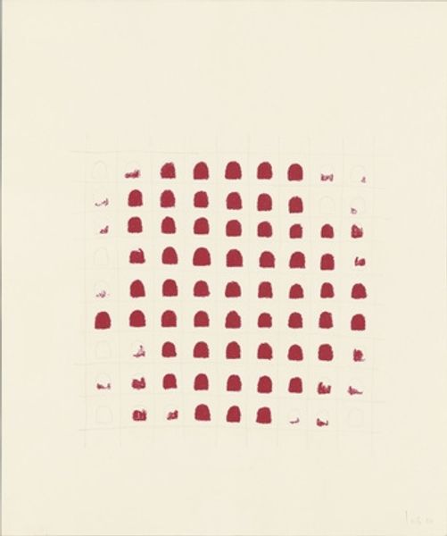
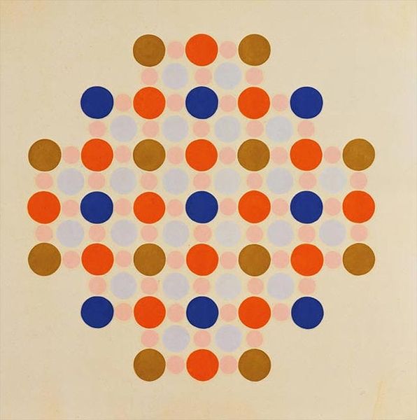
Editor: We’re looking at Thomas Downing’s "Red," created in 1966 using acrylic paint. It’s essentially a grid of red and pink circles. I’m immediately drawn to its systematic nature. It feels very clean and almost…clinical? What are your thoughts on how the social context of the '60s might inform this kind of work? Curator: That's a great observation. The hard-edge painting movement, and Color Field Painting within it, were reacting against the gestural intensity of Abstract Expressionism. This clean, almost manufactured look you describe reflected a broader cultural shift toward mass production and the increasing presence of technology in everyday life. Do you think Downing is embracing or critiquing that? Editor: That's a really interesting question! It's hard to say definitively, but the title "Red" feels almost… understated. Like he's consciously removing emotional baggage. It could be seen as a neutral, almost scientific study of color. Is that depersonalization typical of the time, especially considering artistic statements in previous decades? Curator: Exactly. After the World Wars and the rise of consumer culture, many artists were questioning traditional notions of authorship and originality. By using these repetitive geometric shapes and impersonal application of paint, Downing engages in a dialogue about the artist's role and the changing relationship between art and industry. The flatness challenges the viewer's expectations of depth and perspective in art. Do you feel this detachment alters the viewer's relationship to the work? Editor: Absolutely. Without an obvious narrative or visible brushstrokes, you're left to contemplate the formal qualities—the colors themselves, the spatial arrangement, and that repeating pattern. I see the color and design as an echo of the changing social views around mass consumption. Curator: Precisely. Understanding the history helps unlock new levels of appreciation for these deceptively simple compositions. What appears minimal reveals itself to be deeply considered, doesn’t it? Editor: It really does! I’ll definitely view works like this with a much more inquisitive historical lens from now on.
Comments
No comments
Be the first to comment and join the conversation on the ultimate creative platform.
More like this