Copyright: Clarence Holbrook Carter,Fair Use
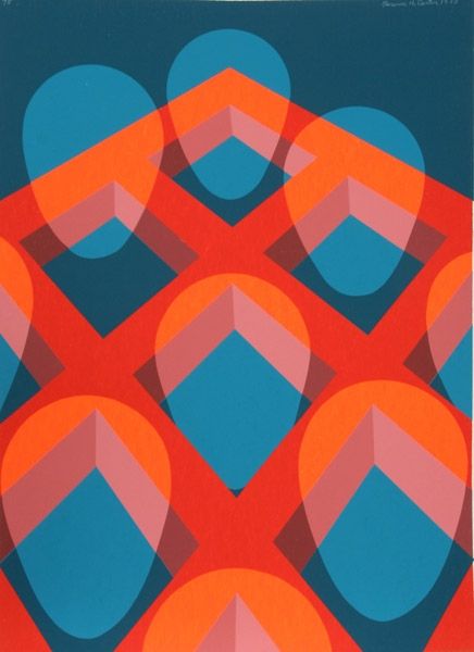
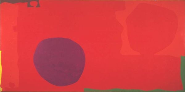
Curator: We are looking at Clarence Holbrook Carter’s “Untitled - Faces in a Grid (Red)”, a 1971 acrylic on canvas. The canvas presents a red geometric pattern overlaid with pale, semi-transparent, vaguely face-shaped forms. Editor: It immediately makes me feel a little uneasy, maybe even trapped. The stark red grid creates this sense of confinement, and the ghost-like faces only amplify that feeling. Curator: Given that this was created in 1971, it’s important to remember the artistic climate. Artists were actively questioning traditional forms. The choice of acrylic points towards embracing industrial, mass-produced materials over the older, more refined oil paints, which in itself signifies a break with the past. Editor: The faces, or face-like forms, give me pause. The grid is cold and repetitive, but these somewhat ethereal shapes offer something softer, almost like ancestral memory trying to surface through the rigid structure of modern life. The fact they're just suggestions of faces allows everyone to bring their interpretations into the fold, their cultural touchstones to the surface. Curator: Right, but the mechanical nature of that grid undermines any purely transcendent reading. If you look at it materially, each square within the grid is identical; potentially produced through a screen printing method which democratizes and subverts what might be deemed as precious in traditional artistic expression. This piece, at its heart, seems to speak about repetition, manufacture and their interaction with visual art at the time. Editor: Perhaps, but there's still something undeniably haunting about those shapes. They echo the iconic depictions of faces throughout history and tap into our shared psychological need for connection. The faces could point towards longing within a depersonalizing era of mass production. Curator: I concede there is definitely ambiguity at play in Carter’s composition and the red itself carries its own symbolic weight: passion or maybe even danger! The genius in its simplicity speaks to Carter’s artistic ingenuity, prompting reflection and reaction from a minimalist perspective. Editor: Exactly, I feel it embodies how symbols adapt across time, subtly guiding us toward recognition and reflection even through layers of abstraction. Curator: Well, considering its complex construction, it's a piece that sparks rich material analysis too! Editor: Yes, indeed. It is a hauntingly ambiguous experience.
Comments
No comments
Be the first to comment and join the conversation on the ultimate creative platform.
More like this