Bandontwerp voor: Max Rooses, De teekeningen der Vlaamsche meesters 1900 - 1915
0:00
0:00
drawing, graphic-art, typography, ink, pen, poster
#
drawing
#
graphic-art
#
comic strip sketch
#
aged paper
#
art-nouveau
#
thick colouring
#
old engraving style
#
personal sketchbook
#
typography
#
ink
#
pen-ink sketch
#
pen work
#
sketchbook drawing
#
pen
#
storyboard and sketchbook work
#
poster
#
sketchbook art
Dimensions: height 435 mm, width 406 mm
Copyright: Rijks Museum: Open Domain
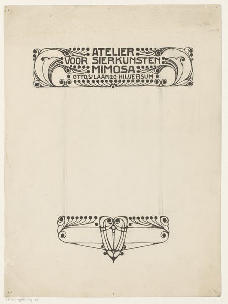
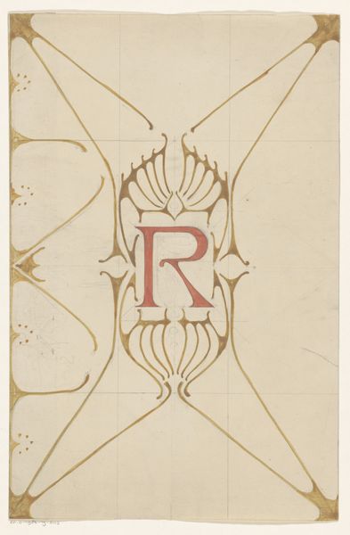
Curator: This is a bandontwerp, a design for the binding of "De Teekeningen der Vlaamsche Meesters," or "The Drawings of the Flemish Masters," attributed to Johann Georg van Caspel, created sometime between 1900 and 1915. Editor: It strikes me as beautifully austere. The use of stark black ink against the aged paper gives it such a high-contrast, graphic punch, wouldn’t you say? It feels incredibly modern despite its age. Curator: Absolutely. The Art Nouveau style is clear, especially in those stylized floral motifs. Note how those geometric flourishes mirror the opening petals, repeating an abstracted symbol of burgeoning creativity across the design. They create visual rhythms, tying the title to the publisher. Editor: And speaking of publisher, “L.J. Veen Amsterdam,” the labor involved in printing must have been considerable. Think of the skilled draftsmen needed to translate van Caspel's design into a reproducible format, not to mention the typesetting involved for that bold typeface. What sort of labor conditions existed then in Amsterdam for these highly skilled craftsmen? Curator: Interesting consideration. It’s important to recognize this work as not merely decorative, but carrying the weight of cultural identity. It highlights the perceived significance of these "Flemish Masters." Each element acts as a marker for prestige, cultural heritage, and perhaps, an aspiration to define a specific artistic lineage. Editor: Precisely! It really underscores how art book production intertwines creative vision with complex production processes, social class, economics, and even cultural marketing. Curator: The entire design—with its mix of delicate lines and firm geometric shapes—evokes an immediate sense of crafted care, a hallmark of the Art Nouveau aesthetic's devotion to bringing beauty into mass-produced items. Editor: Indeed, by interrogating not just the 'what' but the 'how,' we gain a deeper appreciation of the social fabric woven into the materiality of art. This transforms how we value even seemingly simple graphic art like this. Curator: A potent reminder that behind every book lies a web of intent, a story woven in symbols, material, and memory. Editor: It definitely makes you think about the value judgments imposed through both artistic skill, design choices, but also the selection of materials. Fascinating!
Comments
No comments
Be the first to comment and join the conversation on the ultimate creative platform.
More like this