#
abstract-expressionism
#
form
#
abstraction
#
line
#
monochrome
Copyright: Robert Motherwell,Fair Use
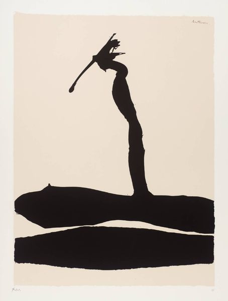
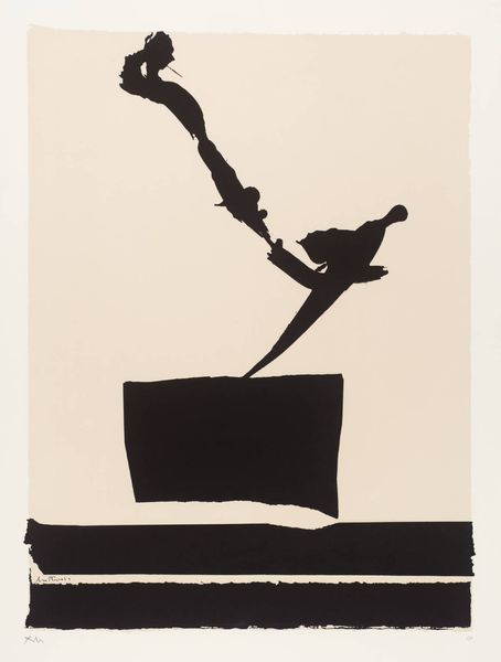
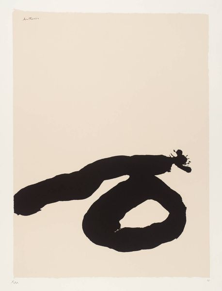
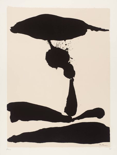
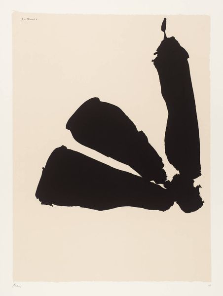
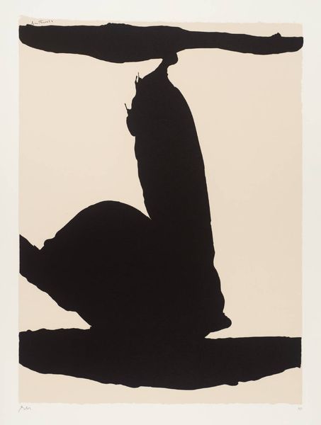
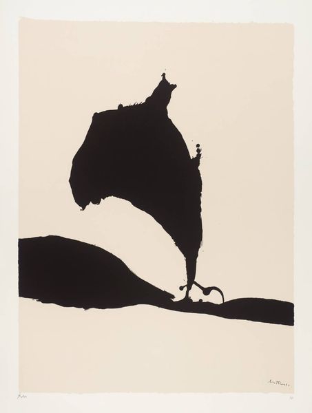
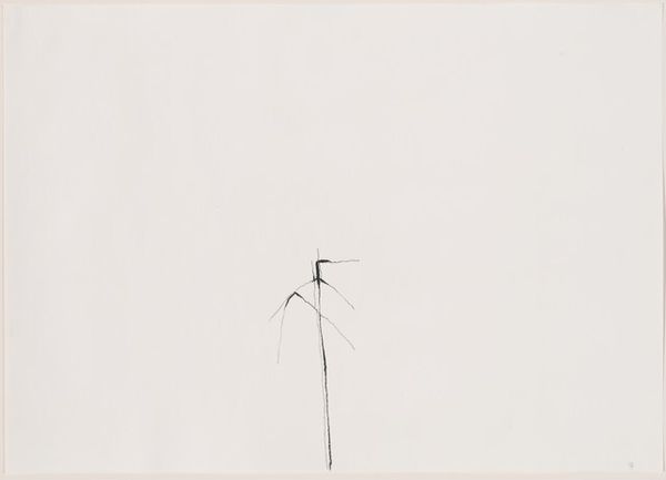
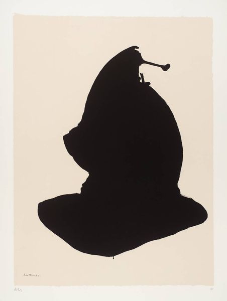
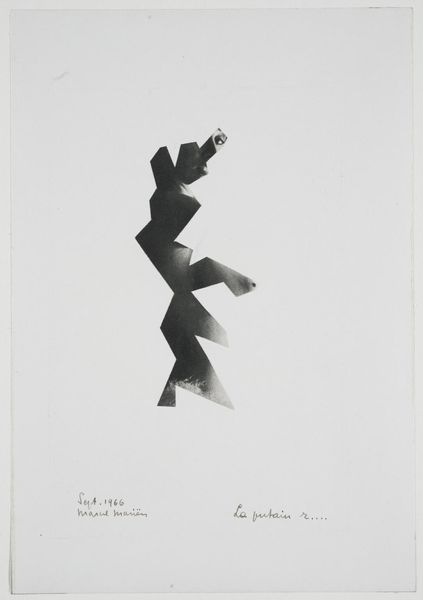
Robert Motherwell made this piece, Africa 6, with lithographic ink on paper, and what really grabs me is its directness. It's all about process. The stark contrast between the black ink and the creamy paper creates a dramatic tension. The ink isn't fussy; it's laid down with confidence, a kind of splash-and-go approach that embraces chance. Look at the upper mark, it’s almost calligraphic, full of energy, like a brushstroke frozen in mid-air. Then there’s this big, dark shape at the bottom, anchoring the piece, providing a counterpoint to the lighter, more gestural marks above. It’s like a conversation between intention and accident. Motherwell reminds me a bit of Franz Kline, especially in his use of bold, black strokes. But Motherwell has a sensitivity, a kind of poetic touch that’s all his own. It’s in the little drips, the variations in the ink’s density, it invites us to contemplate the endless possibilities of art.
Comments
No comments
Be the first to comment and join the conversation on the ultimate creative platform.
More like this