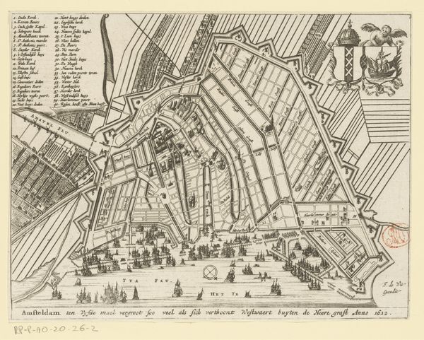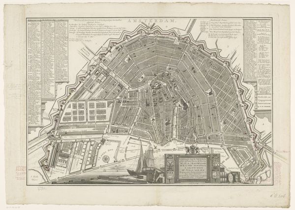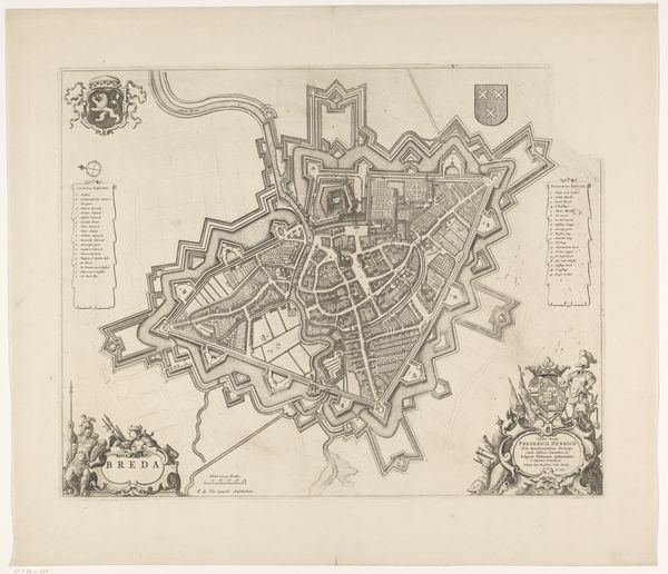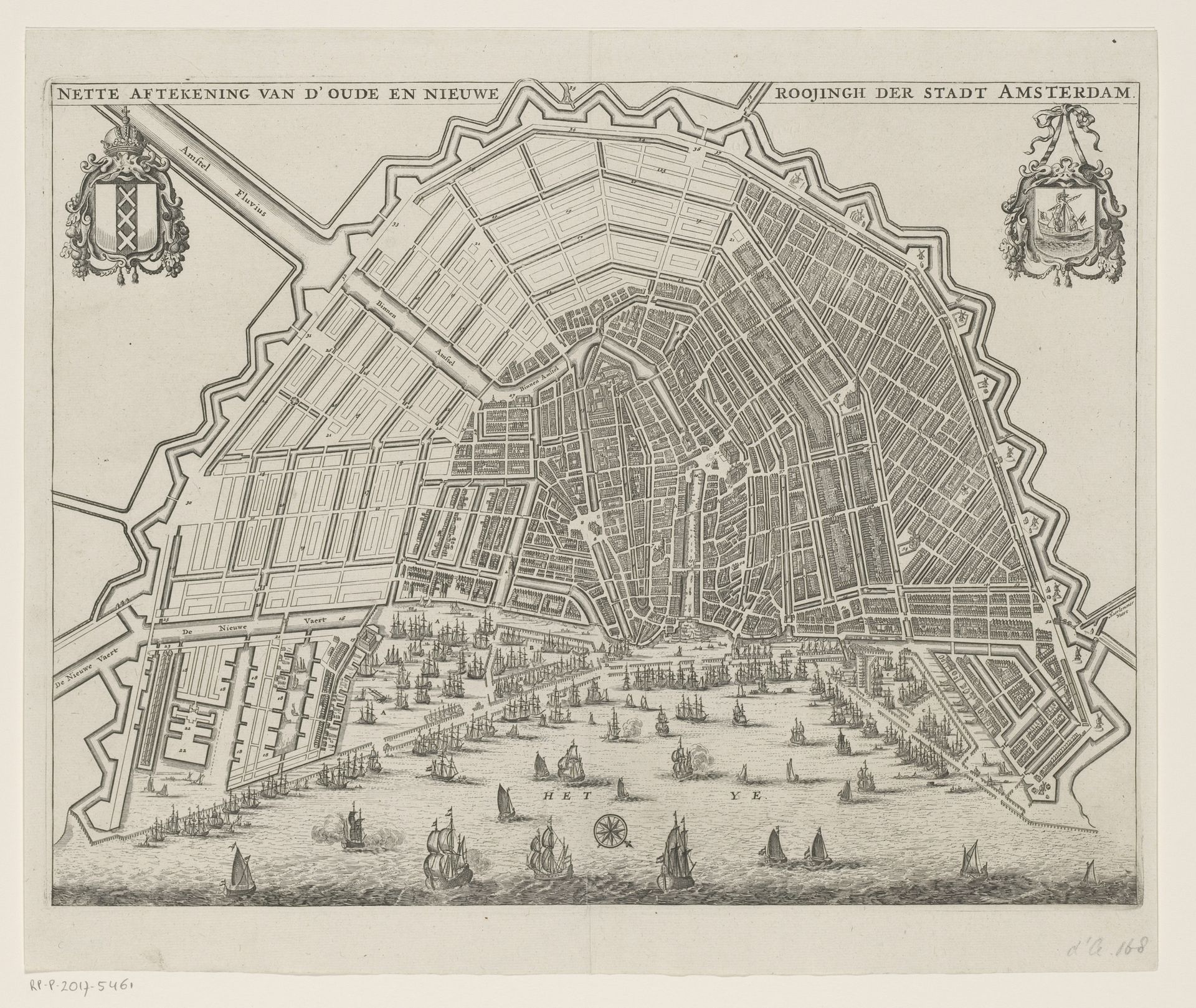
1663 - 1726
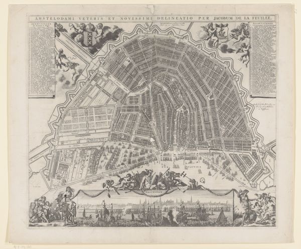
Plattegrond van Amsterdam met ontwerp voor de Vierde Uitleg
Listen to curator's interpretation
Curatorial notes
Editor: This is an old map of Amsterdam, called "Plattegrond van Amsterdam met ontwerp voor de Vierde Uitleg." It's from between 1663 and 1726. The city looks so organized! What's most striking to me is how the city's layout is like a carefully constructed grid spreading outwards. What do you make of it? Curator: The grid, yes, and notice how that structure practically bursts from the older, more organic heart of the city. Think of what that geometry represents: control, planning, a projection of power and wealth. Consider also the ships on the water – symbols of trade, exploration, and Amsterdam’s dominance. Does it remind you of anything? Editor: Now that you point it out, the water kind of reminds me of depictions of crowds of people! How the ships, almost uniformly spaced, might suggest a feeling of collected momentum... but what's that building to the upper right? It's just hanging off the rest of the edge! Curator: Interesting observation! That form is indeed compelling, like a world-eater ready to engulf. Do you think there may be some symbolic association between the geometric organization and a desire to organize things not strictly bound to geometry, like nature or even groups of people? Perhaps to reflect on Amsterdam's role in global commerce and the projection of its influence. Editor: Oh, that’s fascinating! So, the map isn’t just about geography, but about Amsterdam’s ambitions and its view of the world. I see it as almost like a… power play visualized. Curator: Precisely. Maps are never neutral; they’re always encoded with cultural values and aspirations. It really makes you think about how we perceive our place in the world and the symbols we use to represent that.