Copyright: (c) Ellsworth Kelly, all rights reserved
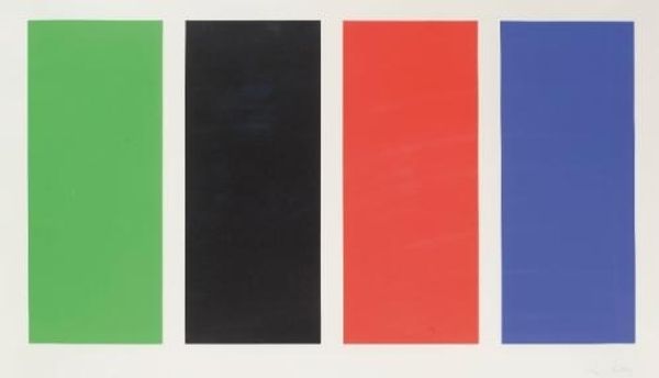
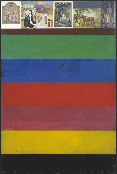
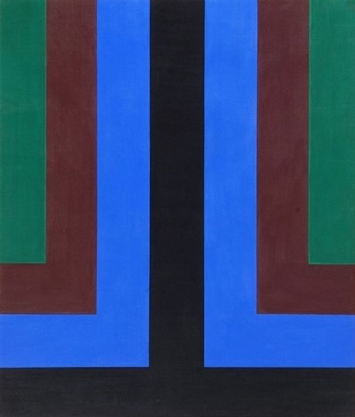
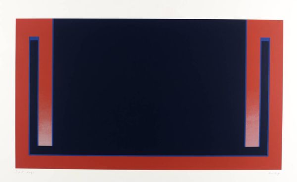
Ellsworth Kelly made this, Blue-Green-Black-Red, using flat planes of color, just laid out like that, simple, clean, and so very satisfying. There’s something about the way these colors sit together, so calm, yet so vibrant. I think that Ellsworth Kelly got it right by using that black. It anchors the other colors. The red has a really strong impact, it balances the blue out. It’s like he’s saying, “Here are colors, existing together. Take them in.” And that’s the thing about Kelly’s work. It’s not about what it represents, but how it makes you feel. He invites you to really see the colors, the shapes, the spaces between them. Thinking of Albers and his Homage to the Square series, but with a totally different vibe. It's all just color and shape doing their thing. It’s a reminder that art doesn’t always need to be complicated to be profound.
Comments
No comments
Be the first to comment and join the conversation on the ultimate creative platform.
More like this