drawing, paper, ink
#
portrait
#
drawing
#
aged paper
#
hand written
#
hand-lettering
#
hand drawn type
#
hand lettering
#
paper
#
ink
#
hand-written
#
hand-drawn typeface
#
fading type
#
thick font
#
handwritten font
#
modernism
Copyright: Rijks Museum: Open Domain
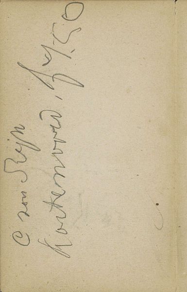
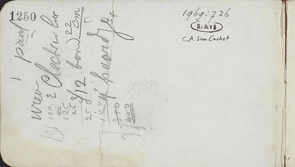
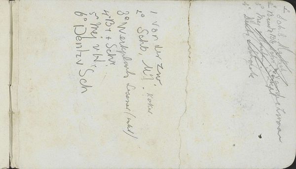
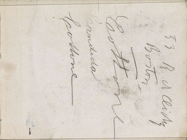
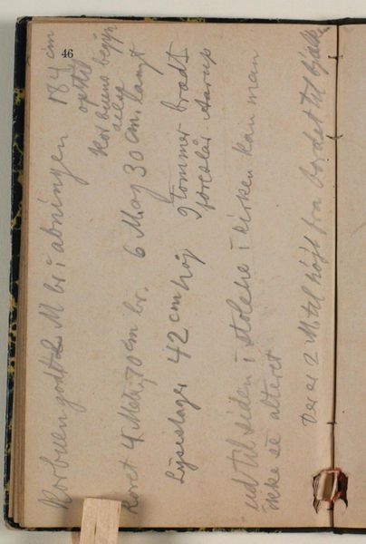
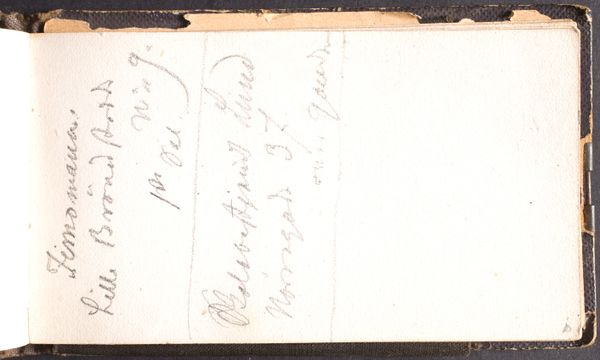
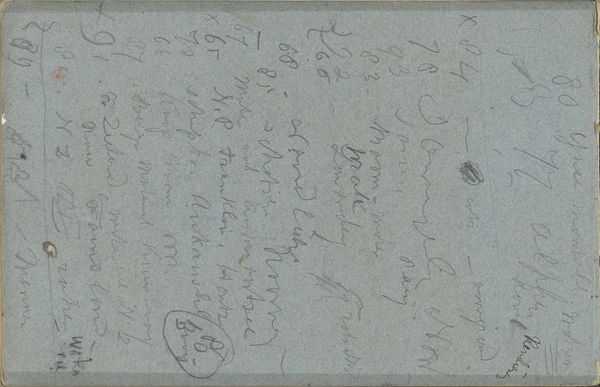
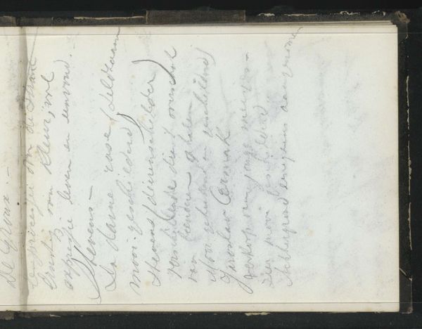
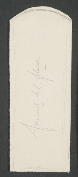
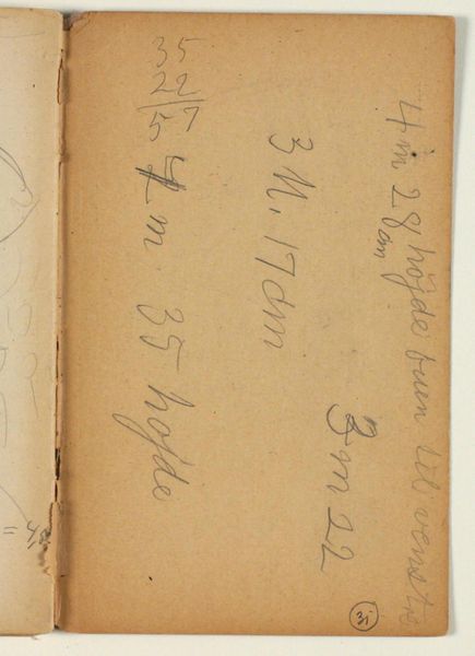
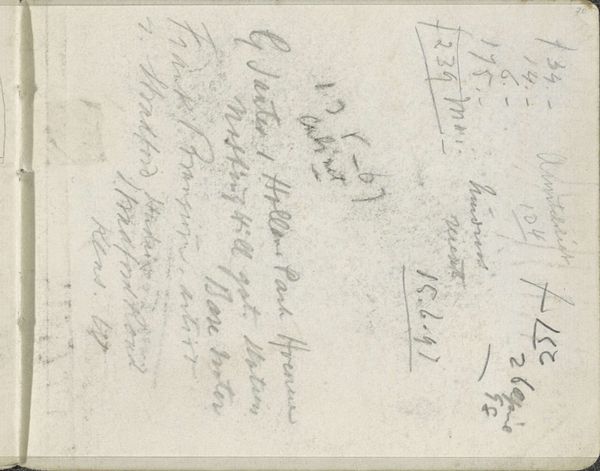
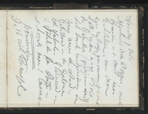
Editor: This is "Annotaties," created in 1893 by George Hendrik Breitner. It’s an ink drawing on paper, and what strikes me is how aged the paper looks and the hand-lettering gives the impression of almost a found object—but it feels deliberately constructed at the same time. What visual elements stand out to you? Curator: Indeed. Note how the artist utilizes the formal elements to create visual interest. Consider the relationship between the aged, almost faded, quality of the paper and the clear, precise lines of the ink. There’s a tension there, wouldn’t you agree? The contrast between the ground and the figure, in this case the written text, invites us to consider the inherent qualities of each. The textures create depth. What function do you suppose is served by the orientation of text on the surface? Editor: That contrast really highlights the intentionality, and the orientation directs the viewer’s eye deliberately through the whole composition. Are you suggesting that the hand-lettering itself becomes a form, almost divorced from its semantic meaning? Curator: Precisely. Observe the thick, deliberate font choice – the script, rendered by hand, isn’t simply conveying information; it’s contributing to the visual texture, the inherent artistic expression. Note how the weight and balance create a powerful impact on the eye. Do you think the formal presentation is successful in achieving this? Editor: I do! It has given me a greater appreciation for the power of line and texture to carry meaning. I was so focused on what the words *said*, not how they *looked*. Curator: Understanding the formal elements truly unlocks new layers. Every line, every shade becomes intentional, forming a new, complex reading experience.
Comments
No comments
Be the first to comment and join the conversation on the ultimate creative platform.
More like this