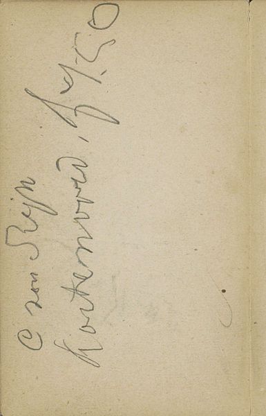
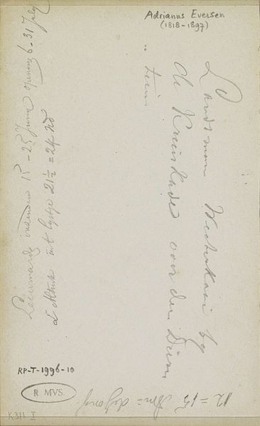
Ontwerp voor een apothekersetiket voor levertraanemulsie 1884 - 1952
0:00
0:00
drawing, paper, pencil
#
drawing
#
art-nouveau
#
paper
#
pencil
Dimensions: height 141 mm, width 51 mm
Copyright: Rijks Museum: Open Domain
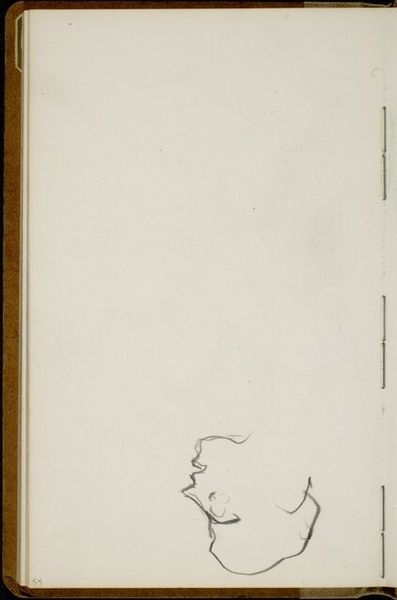
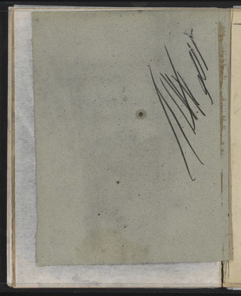
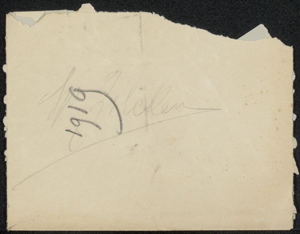
This is Reinier Willem Petrus de Vries' design for a cod liver oil emulsion label, made with graphite. You know, it's kind of funny to think about the process behind something we usually just glance at. De Vries had to consider the shape, the lettering. You can see those delicate graphite lines sketching out the final form. The slightly fuzzy texture and pale colour makes me think of an aged document, there's a quietness to it. And look at the signature, how it flows like a stream. It's like de Vries is practicing calligraphy but with the intention of it becoming a commercial label. It reminds me of Man Ray playing with everyday objects, turning them into art. This piece isn't just about function, it's about seeing the beauty in the mundane. It’s a reminder that even the most ordinary things can be a site of thoughtfulness.
Comments
No comments
Be the first to comment and join the conversation on the ultimate creative platform.
More like this