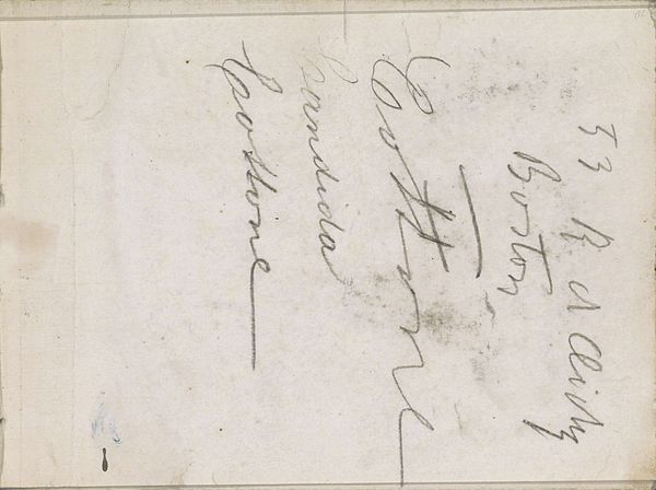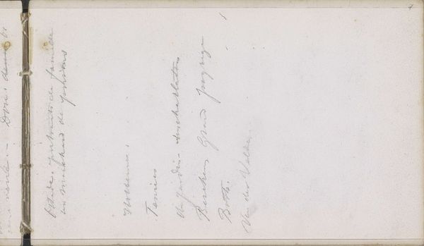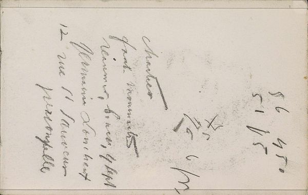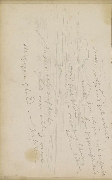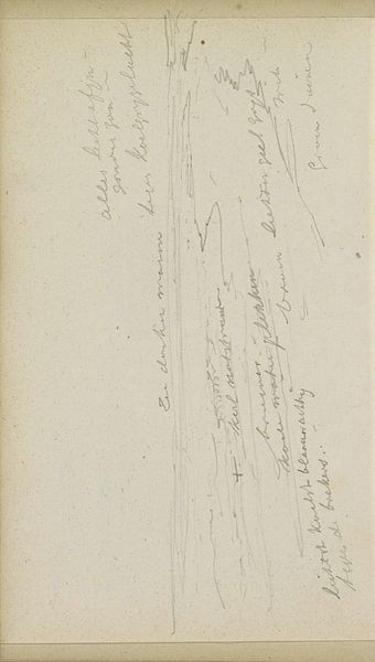
1909
Annotatie
George Hendrik Breitner
1857 - 1923Location
RijksmuseumListen to curator's interpretation
Curatorial notes
Editor: Here we have George Hendrik Breitner's "Annotatie," created in 1909. It's ink on paper and feels almost like a personal journal entry. I'm struck by the slant of the handwriting across the aged paper. What visual elements stand out to you? Curator: The initial impression is undeniably graphic, dominated by the stark contrast of the ink against the ground of the paper. One might first note the linearity of the script itself, which moves dynamically across the field. How do you perceive the formal properties of this script, beyond its legibility? Editor: I see, it is less about what it says and more about how the lines and shapes create a rhythm. It's almost calligraphic, despite probably being more of a note. What’s significant about the positioning of the text? Curator: Observe how the diagonal arrangement, bisecting the rectangle, generates a tension. The words become shapes. This placement creates a spatial dynamic. And consider the visual weight. Is it balanced? Where does the eye travel and why? Editor: Not really, it makes me feel slightly unbalanced and emphasizes how simple it is, I guess? And I suppose I track from top left to bottom right. But the slight fading makes me notice that there isn’t an erasure or layering happening… How does this add meaning? Curator: Exactly. That perceived imbalance, that spatial ordering - Breitner exploits these sensations. This hints to an almost immediate quality. A pure transfer, you might say. But observe also, what effect do these slight imperfections, these disruptions, exert on your appreciation of the drawing as a whole? Editor: Interesting! I was seeing the imperfections as just the result of age. Now I understand how crucial the balance between surface, line, and imperfection becomes. Curator: Precisely! A vital observation! This piece provokes contemplation on the core principles of artistic intent within simplicity itself.