#
toned paper
#
light pencil work
#
pencil sketch
#
personal sketchbook
#
ink drawing experimentation
#
pen-ink sketch
#
sketchbook drawing
#
watercolour illustration
#
sketchbook art
#
watercolor
Dimensions: height 115 mm, width 83 mm
Copyright: Rijks Museum: Open Domain
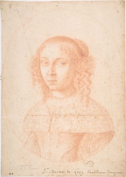
Editor: Here we have Petrus Clouwet’s "Heilige Margaretha als martelares," created sometime between 1639 and 1670. It looks like ink and watercolor on toned paper. The oval composition and reddish hue give the work a warm feeling, but the subject matter suggests something darker. How do you interpret this work, looking at its visual structure? Curator: Note the interplay between line and form. Clouwet uses delicate hatching to define the contours of Saint Margaret, lending a three-dimensionality to the figure while remaining distinctly graphic. Consider the subtle use of value; it creates a halo effect, drawing our eye to her face and implying divine light. Editor: Yes, and the Saint seems detached, with only a palm frond to suggest her martyrdom, although the dragon next to her head does offer a small clue. Curator: Indeed. Semiotically, the palm represents victory, but observe its placement in her hand and its subtle echo of the dragon’s tail. What does the placement of these symbolic elements suggest? Editor: Maybe a parallel between triumph and temptation? Are you suggesting the drawing is not literal in its message? Curator: It proposes the intrinsic elements of this work—composition, line, form—generate the ultimate meaning. The circular frame isolates the action. What would change if this boundary weren't in place? Editor: Removing the border would make her appear less removed and make her more approachable, perhaps? Seeing how you consider these basic aspects has helped me better appreciate Clouwet's piece! Curator: Agreed. By engaging with the formal aspects, the symbolic reading has gained depth and complexity.
Comments
No comments
Be the first to comment and join the conversation on the ultimate creative platform.
More like this