print, woodcut
# print
#
pen sketch
#
landscape
#
woodcut
#
line
Dimensions: height 241 mm, width 337 mm
Copyright: Rijks Museum: Open Domain
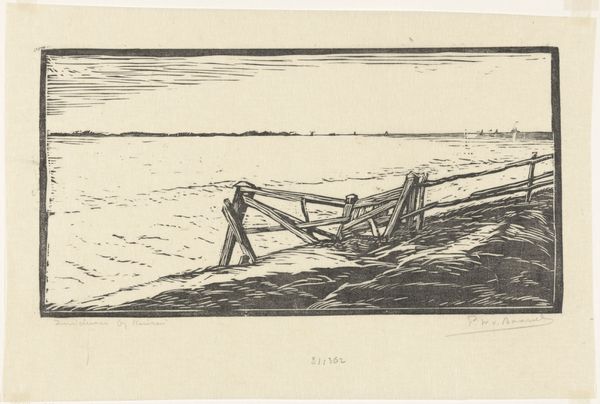
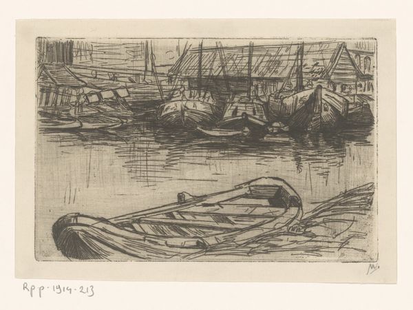
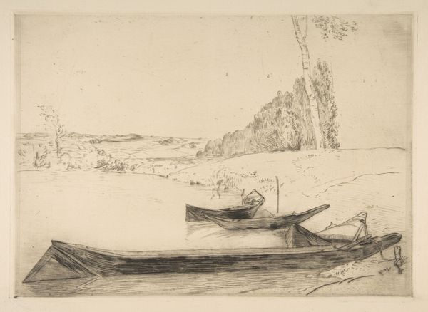
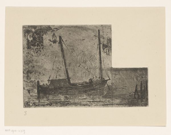
Editor: We’re looking at "Twee boten in het water" which translates to "Two Boats in the Water" by Janus de Winter, dated sometime between 1892 and 1951. It appears to be a woodcut print. I’m struck by the heavy contrast and how the composition is divided into three distinct horizontal sections. What do you see in terms of the formal elements at play? Curator: The division you noted is quite pertinent. Notice the distinct horizontal bands – sky, water, and land – each employing different textural strategies. The sky is fractured with short, nervous lines, suggesting movement, while the water presents a smoother, calmer linearity. The ground, densely packed with irregular marks, gives a sense of solidity and weight. How does the artist use the black and white contrast to create depth? Editor: It seems like the high contrast emphasizes the foreground, bringing the boats forward, but flattens the other zones, pushing them back. I guess without color or shading, it really is the line and tone that dictate everything. Curator: Precisely. Observe the bold, decisive lines that define the forms. The simplified shapes and stark contrast create a powerful, graphic quality. What do you make of the blank space around the central image? Editor: I think the blank space frames the composition but also reinforces the overall feeling of quiet, if that makes sense? What stands out to you most about the work’s structure? Curator: It's the tension between representation and abstraction inherent in the medium itself. The artist captures the essence of the scene using a limited vocabulary of lines and shapes. It's a testament to the power of simplification and reduction. This exploration of form can teach us a great deal. Editor: Absolutely, I didn't really see it that way at first, but considering the formal composition does make you see the landscape in a more distilled manner.
Comments
No comments
Be the first to comment and join the conversation on the ultimate creative platform.
More like this