watercolor
#
water colours
#
impressionism
#
landscape
#
watercolor
#
genre-painting
Dimensions: height 316 mm, width 462 mm
Copyright: Rijks Museum: Open Domain
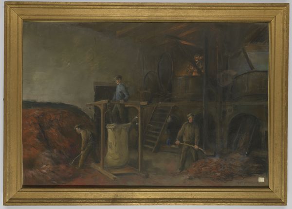
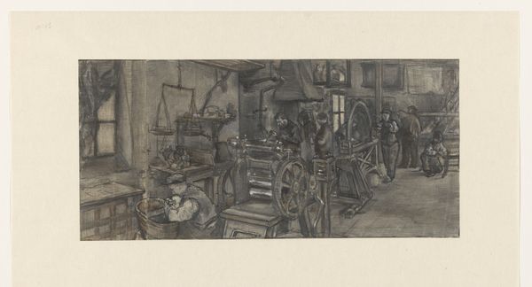
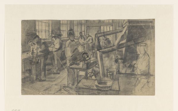
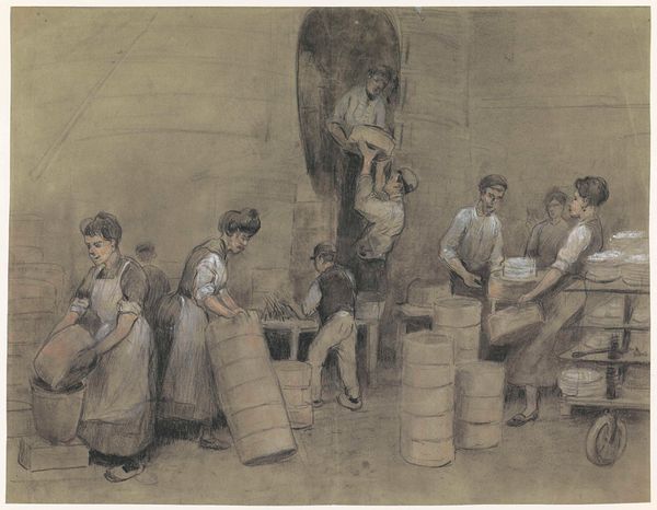
Curator: Here we have "In de roodververij" or "In the Red Dye Works," a watercolor by Anthon Gerhard Alexander van Rappard, likely created between 1868 and 1892. It offers a fascinating glimpse into the world of industry. Editor: My first impression is that the painting is dominated by the color red, in so many variations: rich and saturated, watery and thin. It creates a powerful visual statement. Curator: Absolutely. Van Rappard, who was a friend of Van Gogh, often depicted the lives of working-class people. This piece shows us the interior of a dye works, providing insight into a common profession. Notice the figures, they're more than just generic staffage—they're engaged in the labour of dyeing. Editor: I agree, though, it seems more observational than celebratory, it reminds me of Impressionism in its visual sketch. See how the light reflects on surfaces and the dynamic composition leading my eye through this busy and hectic setting? It lacks the meticulousness of more academic renderings of industrial subjects. Curator: His connection to the Hague School is clear. The realistic depictions, with the emphasis on atmosphere and light, serve as a counterpoint to academic painting styles prevalent in the late 19th century. There is a deep exploration of social class at work. Editor: I notice the mechanical nature of the dyeing process, and how Van Rappard rendered the harsh light and steam which contribute to the grimy texture. There are lines, shades, light, and colour which draw me into the working conditions and, frankly, discomfort of being there. It feels immersive. Curator: Indeed. The scene reflects broader shifts happening within the Dutch art world as artists increasingly focused on everyday subjects and the social realities of their time, depicting labor and its environment. Editor: Looking again, I really see how the composition draws one’s eye from the intense reds in the foreground, up along the dangling cloth, and into the subdued figures. A kind of cyclical tension exists between foreground, the line of dyeing, and those standing, labouring to do this job. Curator: Yes. The painting encourages us to reflect on the human element within these industrial landscapes, the working man performing this labour and, for Rappard and perhaps the viewer, their inherent human dignity in these conditions. Editor: It is true; through close examination, what appears simple on the surface reveals deeper meaning in the colour choices and perspective, prompting me to reconsider my immediate sensory interpretation and seek broader implications.
Comments
No comments
Be the first to comment and join the conversation on the ultimate creative platform.
