1668 - 1716
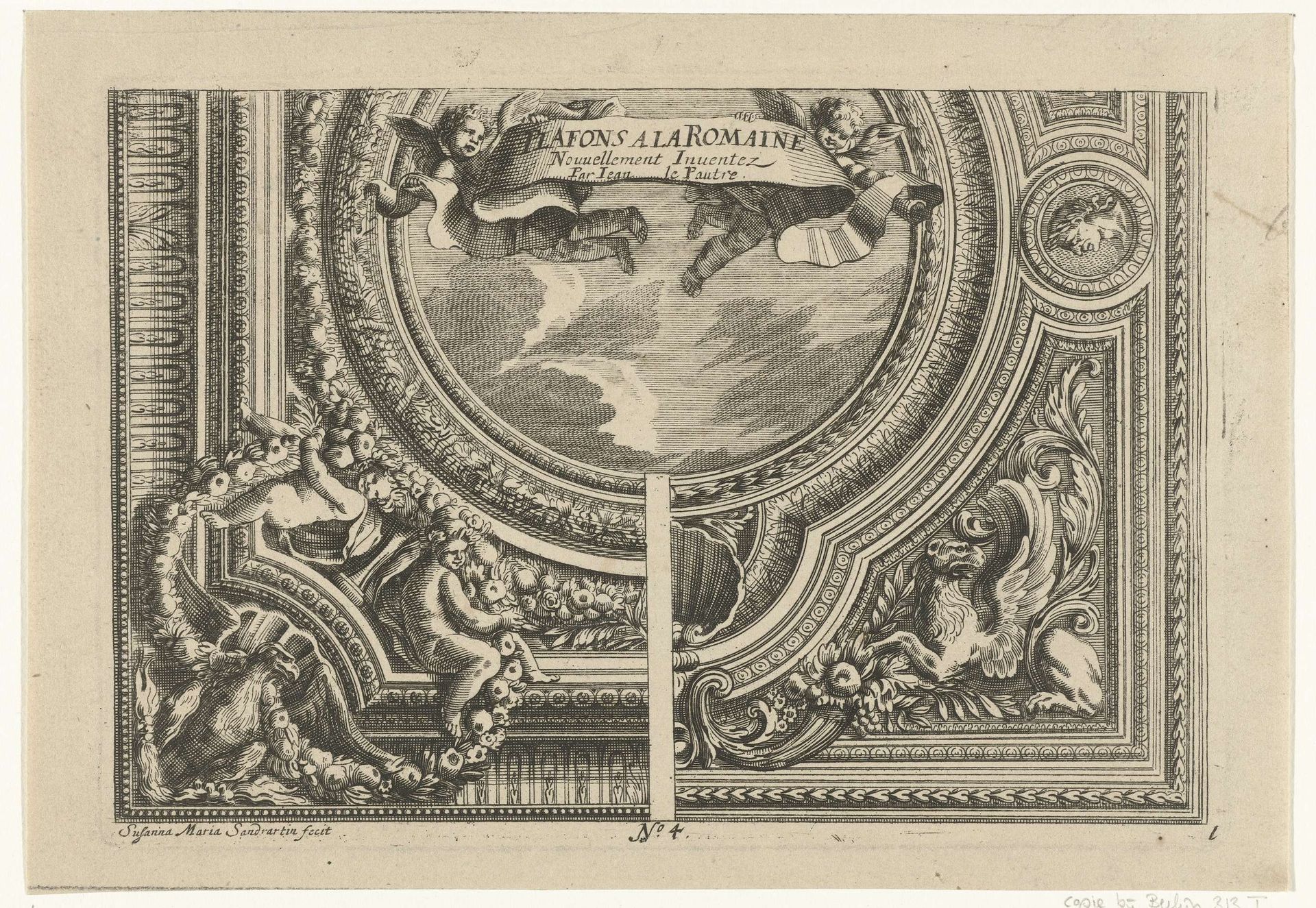
Titelblad: Plafons A La Romaine
Susanne Maria von Sandrart
1658 - 1716Location
RijksmuseumListen to curator's interpretation
Curatorial notes
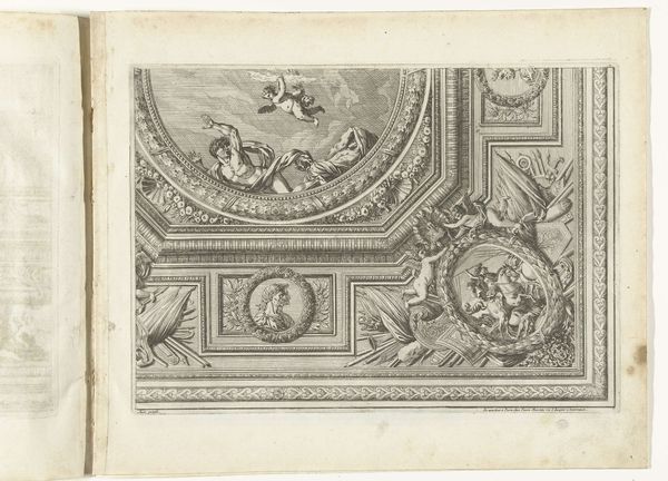
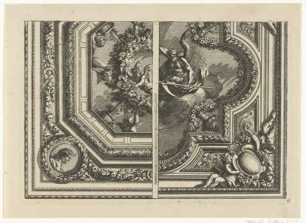
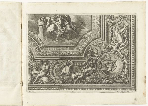
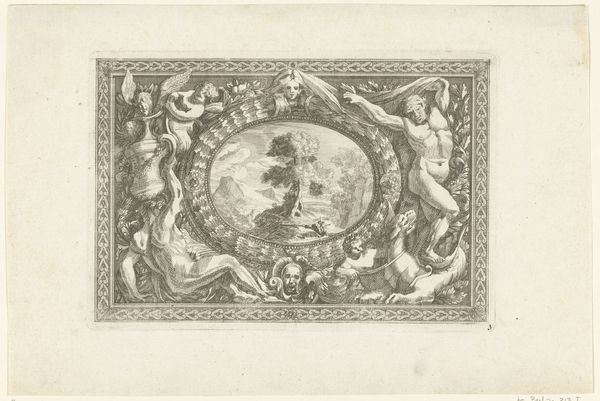
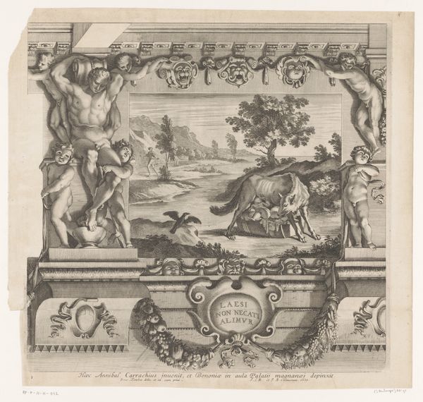
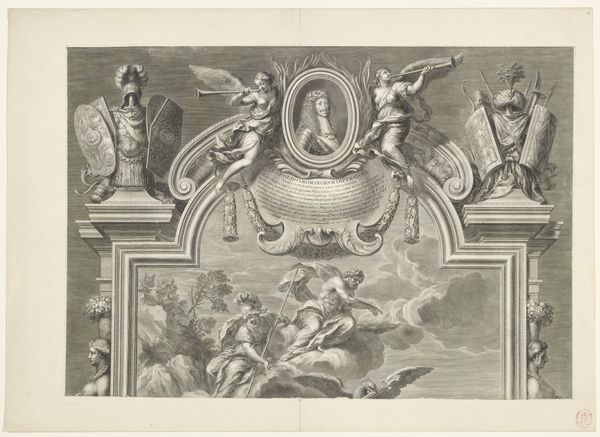
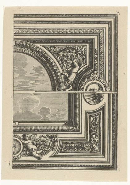
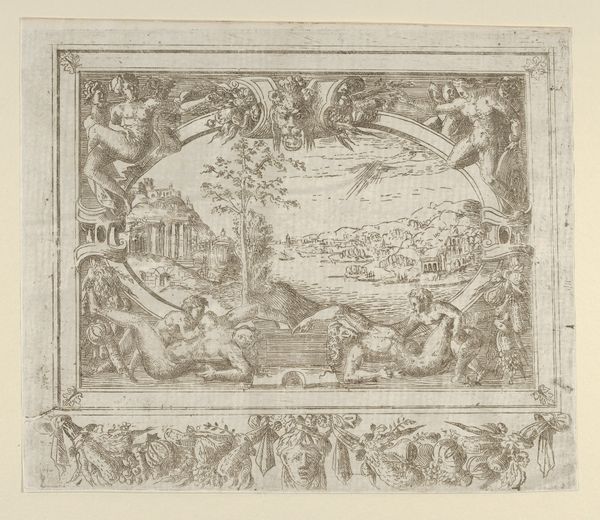
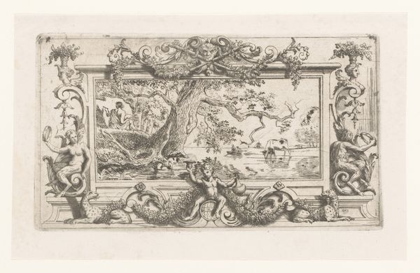
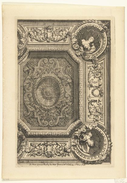
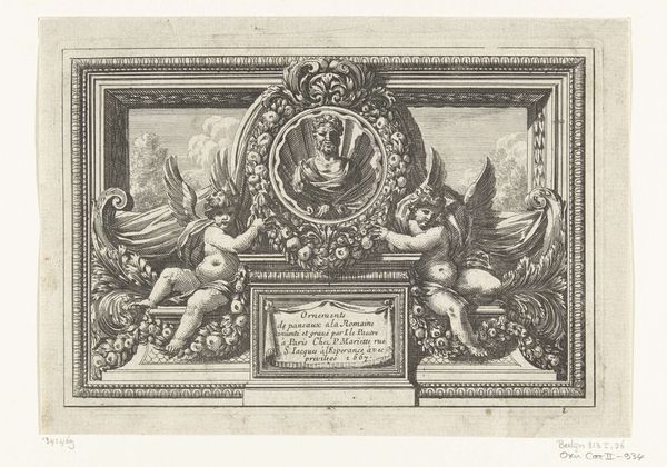
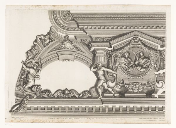
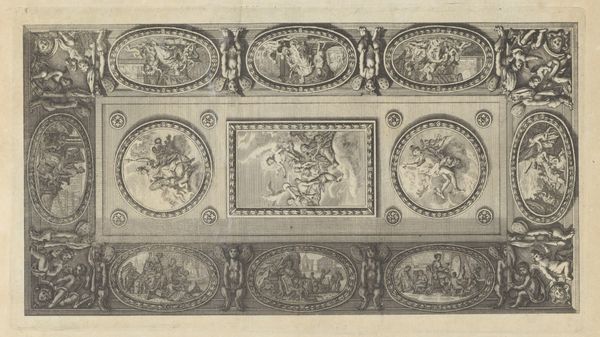
Curator: Before us we have Susanne Maria von Sandrart's "Titelblad: Plafons A La Romaine," created sometime between 1668 and 1716. It resides here at the Rijksmuseum. Editor: My first impression is lightness, almost a whimsical feel. There are cherubs, swirling clouds, the decorative framing that feels pulled from a confectioner's dream. It seems…celebratory? Curator: The artist employs pen work to render a design suggestive of carved stone or wood. The "Titelblad" showcases an elaborate ceiling design, employing symmetry and a clear hierarchy. Consider the framing devices—repeated motifs, concentric circles drawing the eye. Editor: Yes, and I notice that despite all the flourishes, there's a restraint. A deliberate use of negative space which emphasizes the density elsewhere. The winged lions and cherubs seem both earthbound and floating on clouds. Does that make sense? Curator: Perfectly. There's a tension in the interplay between the ethereal figures and the grounded, architectural components. This creates an interesting dialectic. And then there’s the typography… Editor: Ooh, the title banner practically shouts at us! "Plafons a la Romaine," styled in almost cartoonish form, reminds us this piece documents, or even, proposes. It’s not necessarily real! Which then turns the rest of the art into a potential deception? Curator: One could interpret it as a meta-commentary on representation itself. Sandrart, through this exercise, compels us to question not just Roman ceiling designs but the very act of designing, engraving, of envisioning space. Editor: That’s fascinating. I went from thinking it was sweet to now being unsure what it’s actually offering. I like that unsettling! Curator: Precisely! The dynamism stems from this push and pull, a formal engagement rendered visible for our consideration. Editor: Well, now I see this plate a lot different than at first sight. I almost want to say, in the spirit of Roman times: Ave Sandrart. Curator: Indeed. Let's move forward and examine what other aesthetic offerings await us.