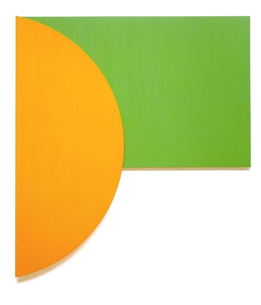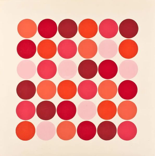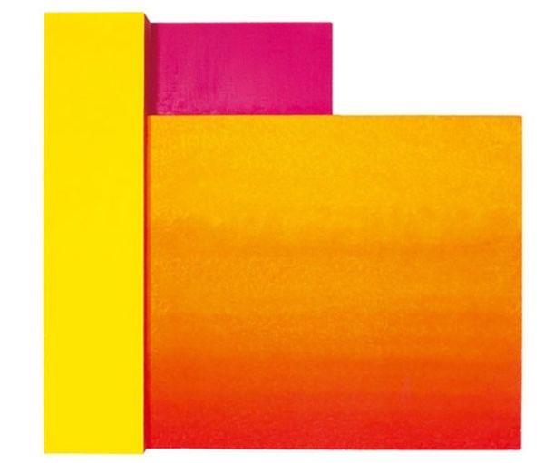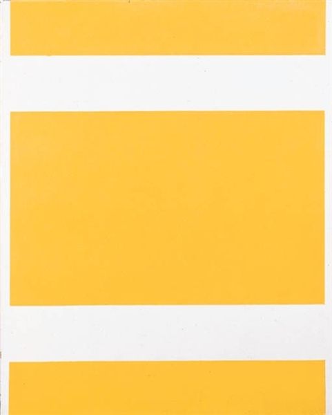
Curatorial notes
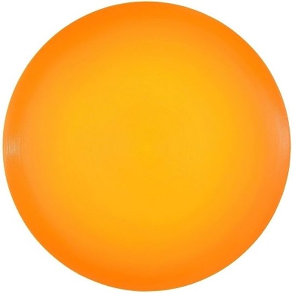
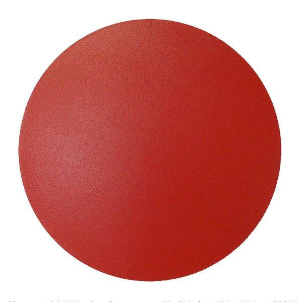
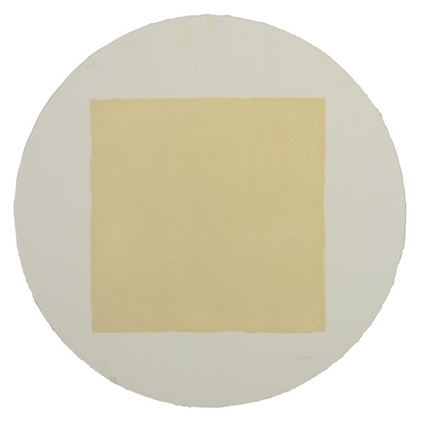
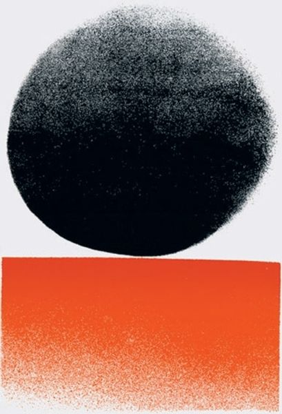
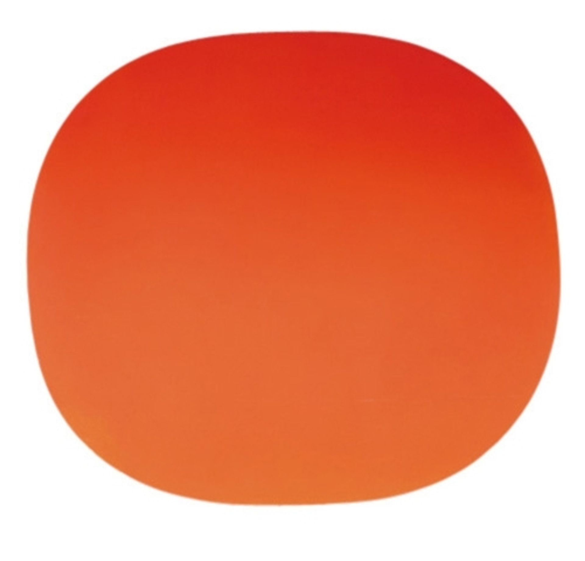
Editor: This is "586/69 (Gerundetes Rot)" by Rupprecht Geiger, painted in 1969. It's acrylic on canvas, and honestly, it's just a big, bright, orange circle. I'm curious— what do you see beyond that striking color and simple form? Curator: Ah, yes, Geiger’s orange. I don’t know about you, but looking at it makes me think of the sun, or maybe the inside of a dreamcicle! He called it "Gerundetes Rot," which roughly translates to "Rounded Red," and I think it's interesting he uses "red" when most people would say orange. I wonder what that distinction meant to him? This is classic Colour Field painting. Does the intensity of the colour itself evoke any feelings for you? Editor: Definitely warmth and a little bit of… well, maybe not anxiety, but a heightened energy. It's so saturated it almost vibrates. I’ve read a little bit about colour field. Was it all about emotions triggered by the hue? Curator: That’s certainly a big part of it. Geiger was really interested in the psychological effects of colour and how they could be used to create a purely emotional experience for the viewer, so no forms to get in the way of pure, saturated feeling! Think about the context. In 1969, people were pretty tripped out about the world and Geiger seemed to respond with this... *poof*, here’s something just meant to be FELT. Isn't it amazing how something so simple can be so powerful? Editor: It really is. I always thought art had to "say" something specific, but this just… *is*. Thanks, this has been eye-opening. I’m walking away looking at the piece and feeling, wow, colour itself has depth. Curator: Absolutely, sometimes it's just about feeling the ‘wow’ in the world around us.