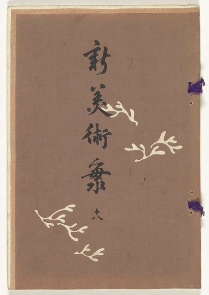
Possibly 1904
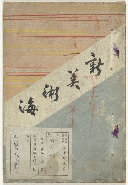
Nieuwe zee der kunsten - 20
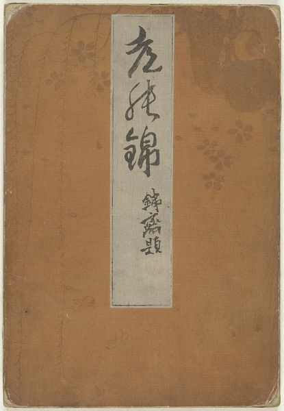
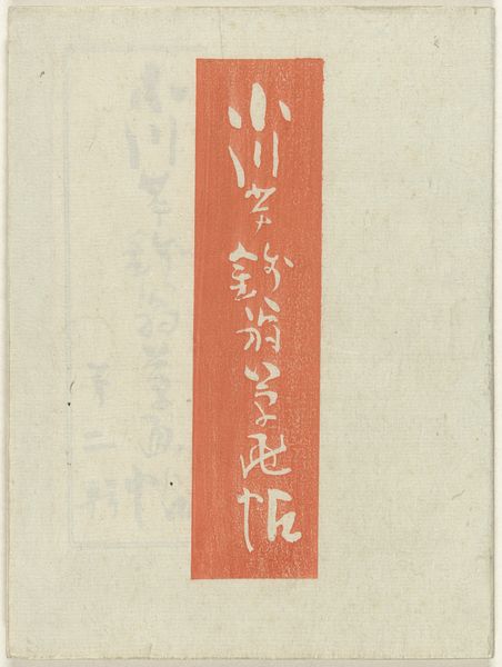
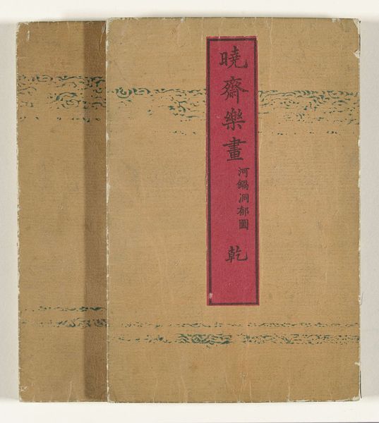
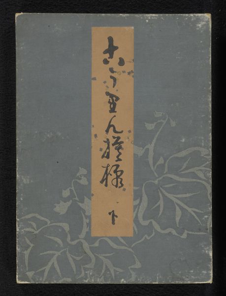
Furuya Kōrin
1875 - 1910Location
RijksmuseumListen to curator's interpretation
Curatorial notes
This is a book from around 1910, by Furuya Korin, and what gets me is how the artist uses the cover as a kind of ground. The brown isn't just a backdrop; it's part of the piece. The marks are so direct; you can almost feel the hand moving. There are calligraphic brushstrokes which seem both precise and free, kinda like a dance. And then these plant motifs, rendered in white ink, or maybe a light pigment, they add this layer of depth, right? It's not just about what's on the surface, but how those marks interact with the texture of the paper or cloth. Look at how the brown bleeds around the white; it creates this aura. I think about someone like Cy Twombly. Both artists allow a kind of open-endedness, leaving space for the viewer to bring their own associations. The beauty here is in the incompleteness, the suggestion of a world, rather than a literal depiction.