mixed-media, print, textile, paper, typography
#
mixed-media
# print
#
asian-art
#
textile
#
paper
#
typography
#
coloured pencil
#
mixed media
Dimensions: height 242 mm, width 164 mm
Copyright: Rijks Museum: Open Domain
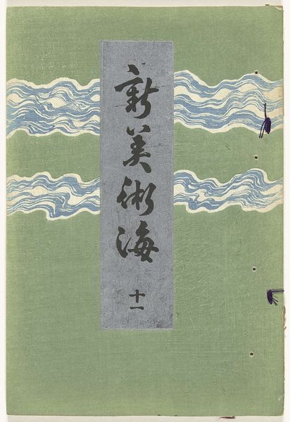
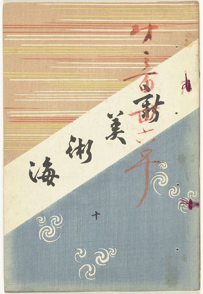
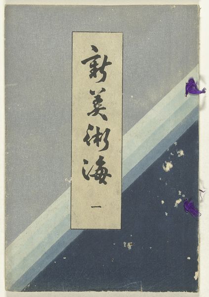
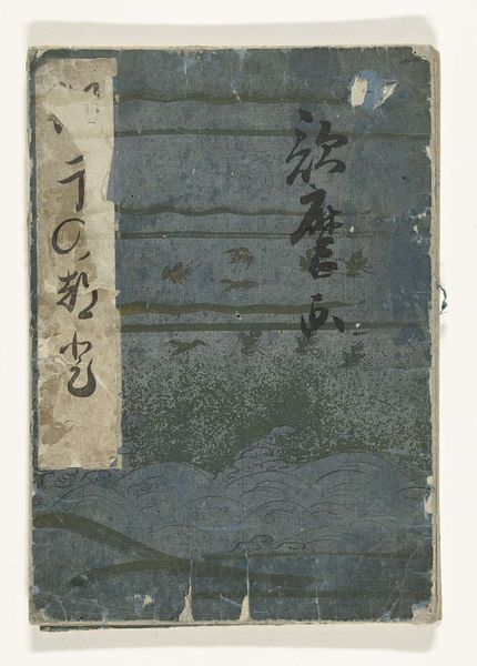
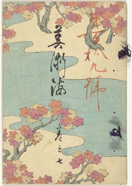
Editor: Here we have Furuya Kōrin's "Nieuwe zee der kunsten - 6", made sometime between 1902 and 1911. It’s a mixed media piece – textile, paper, print. It reminds me of book cover, somehow unsettling and disjointed. What are your thoughts on its visual composition? Curator: Indeed. The piece presents an intriguing interplay of textures and planes. Note the distinct stratification: the linear, horizontally-oriented bands at the top contrast with the oblique, paler section containing the typography. Below this, a different shade creates depth. Observe how this segmentation structures the visual field, creating an unusual tension, resisting easy pictorial unity. Editor: Tension, yes! And the text – how does the typography itself function within this structure? Curator: Semiotically, the Japanese text dominates, drawing the eye first. Its vertical arrangement also counteracts the horizontal bands above, enhancing the visual push and pull we discussed. Even without understanding the literal meaning, the forms of the characters provide a key visual element. Also, it has multiple levels; each level interacts and contradicts the plane above. This tension is created because the work challenges our understanding of a painting by offering a structure we might find unbalanced or even, visually unsettling. What elements contribute most to that feeling for you? Editor: I guess the faded colors, the uneven staining throughout, and those what seem to be pressed flowers add to it the aged affect of the artwork and they disturb the peace that one could imagine because this cover should appeal to one as inviting or captivating instead of somewhat sinister, in my view. I hadn't thought about the meaning of the text as a visual element of form before! Curator: Precisely. Through attention to compositional devices—line, color, texture, plane, script, and medium, you see that it is through structure that a deeper, even subconscious connection can be drawn between artwork and viewer.
Comments
No comments
Be the first to comment and join the conversation on the ultimate creative platform.
More like this