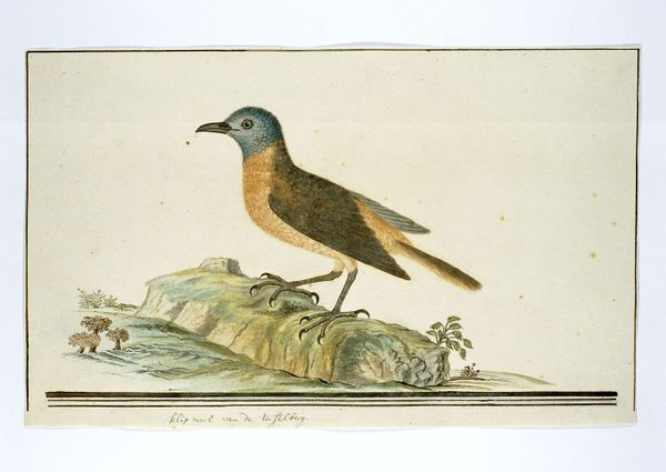
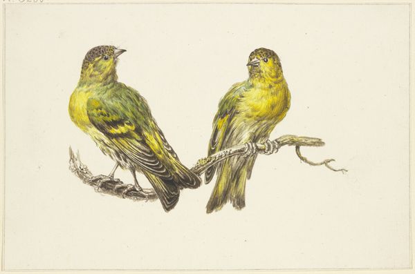
drawing, watercolor, pencil
#
drawing
#
landscape
#
figuration
#
watercolor
#
coloured pencil
#
pencil
#
realism
Dimensions: height 270 mm, width 335 mm
Copyright: Rijks Museum: Open Domain
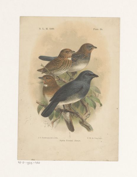
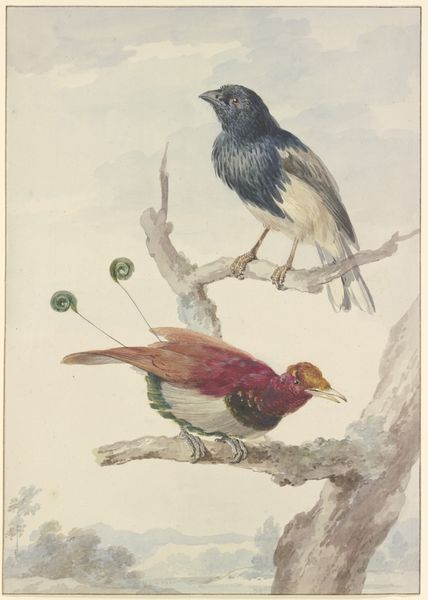
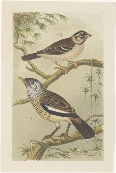
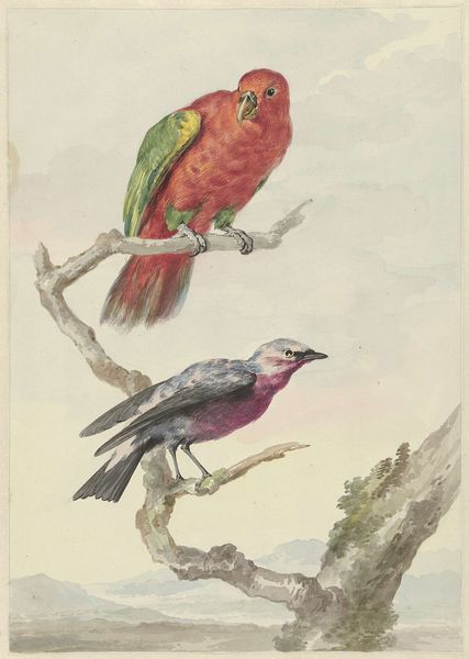
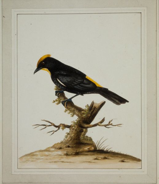
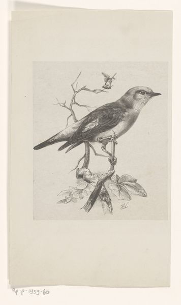
Curator: There’s a real sense of quiet observation about this work. Editor: It's charming, certainly. But I'm struck by the materials. Pencil, watercolor, colored pencil… layered carefully. There’s an element of craft here, the hand evident in the layering. Curator: Indeed. This is "Two Starlings" by Cornelis van Hardenbergh. The Rijksmuseum places it between 1765 and 1873. Editor: That date range intrigues me. Is this a case of delayed reception? Did Hardenbergh's techniques anticipate something, or was there a time lag in the art market that explains why it may have taken a century for a viewer to care? Curator: It’s fascinating, isn’t it? There’s a realism to it that speaks to the era, a growing scientific interest manifested through art. A direct gaze influenced by socio-political interests of science and observation in nature. Editor: That "realism" you mentioned feels incredibly constructed, though. Look at how those bricks supporting the larger bird are arranged; almost stage-like in their placement and construction. Curator: It draws you in, doesn’t it? Note the birds against this architectural element. The old stones evoke a sense of enduring history. And the birds perched upon them – freedom intersecting the permanence of structure. It subtly implies dialogues on nature's role in our societal constructions, or even how the two impact one another. Editor: Yes, but the architecture reads as purely decorative. Almost as if meant to impress someone with this "timeless" quality by presenting a stagey picturesque facade! And who had access to appreciating that? Whose version of reality did this stage support? It highlights how access and aesthetic value intersect in social spaces. Curator: Perhaps a reflection on nature's integration within societal structures? These themes were growing throughout that period... The picturesque also often framed idealized narratives of life. Editor: Possibly… I keep returning to those layers. Watercolors… delicate. Coloured pencil, more controlled. A study in contrasting qualities, and that process would reflect who this was meant to appeal to. Was it intended to capture scientific accuracy or evoke a certain idealized appreciation, for a specific public, of the nature represented? Curator: It gives you much to think about. For me it will always spark something interesting by what its societal context was meant to emphasize. Editor: Indeed, understanding these things requires a recognition of not just what’s depicted, but how it got made and received by the contemporary context of art.
Comments
No comments
Be the first to comment and join the conversation on the ultimate creative platform.
 Collect
 React
React Comment
More like this