Dimensions: 76.2 Ã 91.4 cm (30 Ã 36 in.)
Copyright: CC0 1.0
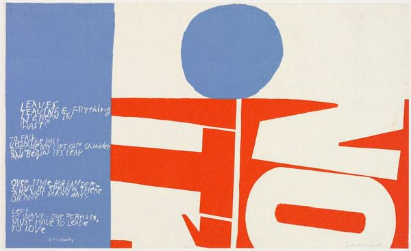
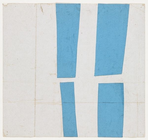
Editor: This is Corita Kent's "tender be - part one - sr. william." I'm intrigued by the bold, blocky letters and the limited color palette. It's so graphic! What compositional elements stand out to you? Curator: The interplay of positive and negative space is indeed compelling. Note how the blue rectangles both define and negate the forms of the letters. What effect does this have on your perception of the textual content? Editor: It kind of blurs the line between image and text, making me focus more on the shape than the meaning. Curator: Precisely. The artist uses form to challenge our conventional understanding of language. It encourages a visual, rather than purely semantic, reading. Editor: That’s so interesting. I never thought of it that way. Thanks! Curator: My pleasure. It’s in exploring the structure that we unlock the artwork's deeper meaning.
Comments
No comments
Be the first to comment and join the conversation on the ultimate creative platform.
More like this