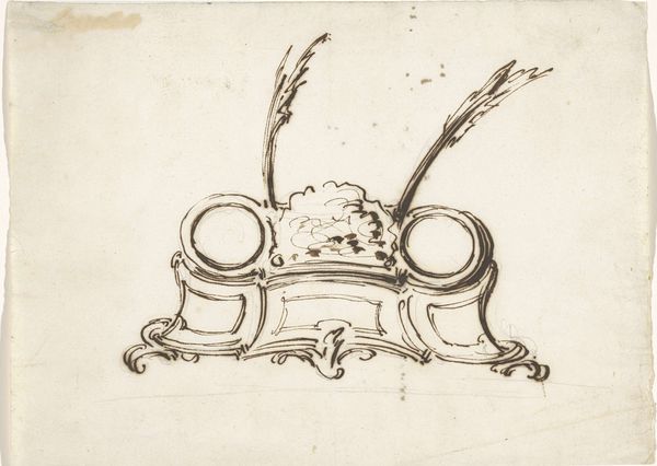
drawing, ornament, ink
#
drawing
#
ornament
#
baroque
#
pen drawing
#
pen illustration
#
pen sketch
#
old engraving style
#
personal sketchbook
#
ink
#
ink drawing experimentation
#
pen-ink sketch
#
line
#
pen work
#
sketchbook drawing
#
sketchbook art
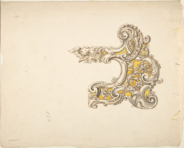
Dimensions: height 165 mm, width 190 mm
Copyright: Rijks Museum: Open Domain
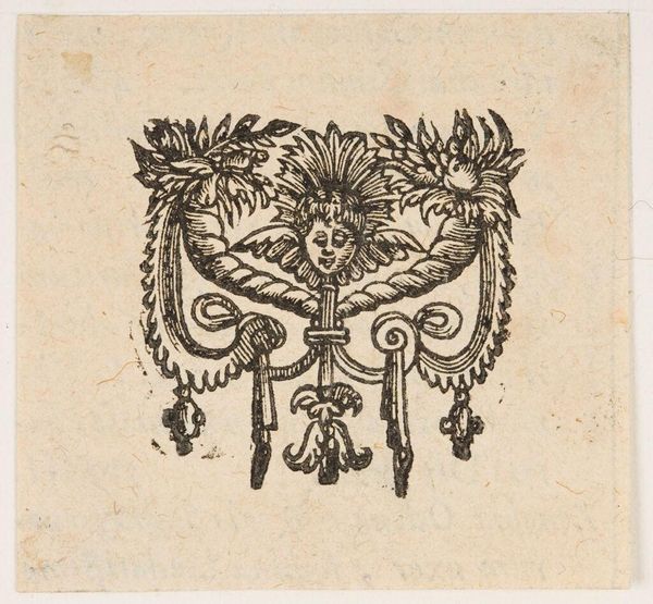
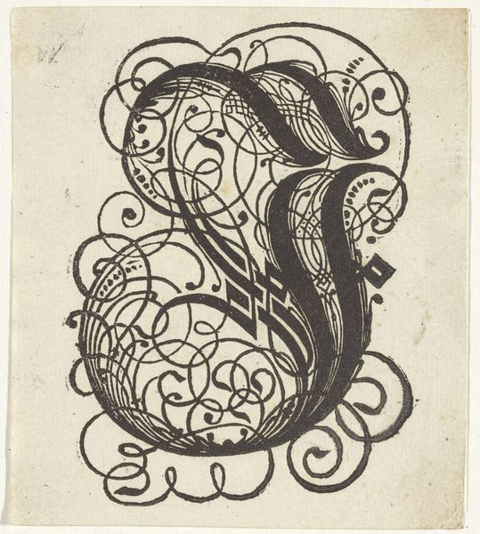
Curator: Today we’re looking at a pen and ink drawing by Gesina ter Borch, titled "Bekroond monogram GTB," dating back to about 1660, now held at the Rijksmuseum. It’s a striking ornamental design. What's your first impression? Editor: Stark, but elegant. The composition is surprisingly balanced despite the apparent freedom of the linework. The stark contrast of the ink on paper creates an immediate visual impact. Curator: The piece really showcases Ter Borch’s skill with line and the medium of ink, doesn’t it? One can easily appreciate the craft of applying this pen technique and the physical making of the work; given that as a female artist she operated within specific limitations and possibilities. Editor: Absolutely, and formally, the symmetry created by the mirrored 'GTB' initials balanced by the crown above, plays with both visual harmony and symbolism. What do you make of the surrounding feathery fronds? Curator: I’m inclined to see them as signifying social status; their resemblance to plumes adorning aristocratic headwear. This work provides insights into the lifestyle and material culture in which Ter Borch existed. Editor: I see them more as decorative elements, adding to the baroque exuberance of the monogram. Their lightness contrasts beautifully with the more solid form of the crown and initials. I’d say this work is a deep meditation on symmetry, balance and contrast. Curator: I find that your focus on form neglects a deeper understanding of Ter Borch’s placement within Dutch Golden Age society. The monogram suggests a level of self-awareness of both the artist and possible patronage conditions in this time, especially for female artists. Editor: And, without appreciating how these formal decisions make this personal branding so effective we diminish Ter Borch's art, and we fail to appreciate what that meant during the baroque. Curator: An interesting juxtaposition, I’ll grant you. This exchange really reinforces the richness inherent in analyzing this drawing through both materialist and formal lenses. Editor: Indeed! A testament to the complexity and beauty Ter Borch brought to even her smaller-scale pen works.
Comments
No comments
Be the first to comment and join the conversation on the ultimate creative platform.
More like this