drawing, ink, pen
#
drawing
#
toned paper
#
light pencil work
#
ink drawing
#
baroque
#
pen sketch
#
personal sketchbook
#
ink
#
ink drawing experimentation
#
geometric
#
pen-ink sketch
#
pen work
#
sketchbook drawing
#
pen
#
sketchbook art
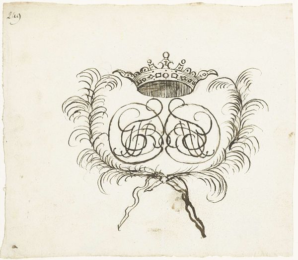
Dimensions: height 196 mm, width 270 mm
Copyright: Rijks Museum: Open Domain
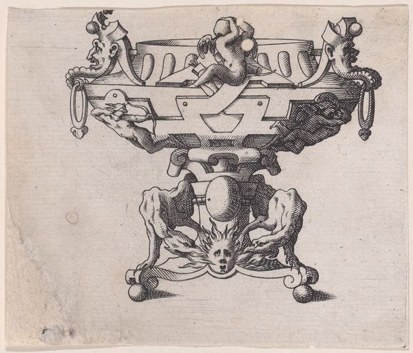
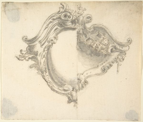
Curator: At first glance, this preliminary sketch by Luigi Valadier around 1760 strikes me with its almost ethereal lightness, despite depicting a relatively solid object. Editor: It does feel delicate, doesn't it? The baroque style ornamentation is playfully offset by the seeming haste of the lines themselves, capturing something of the initial spark of inspiration rather than meticulous crafting. The rapid pen strokes almost give it a fleeting quality, like catching a dream. Curator: Indeed. This piece, "Ontwerp voor een inktstel," showcases a design for an inkstand rendered in ink on toned paper. Consider the function of an inkstand at the time. It’s more than a mere desk accessory, isn't it? It is a potent symbol of literacy, power, and the art of communication. An elite status object, undoubtedly. Editor: The geometric structure grounds it, though. Note the perfectly rendered circles and their placement—the symmetry creates a grounding effect, right in juxtaposition to the frothy ornamentation and playful line work we initially reacted to. A balance between the rational and ornamental minds at work. Curator: Precisely. And the feathered quills perched on either side become totems of the very ideas the inkstand helps bring to life. Feathers—borrowed from birds—represent aspiration, flight, and the soaring imagination. The inkstand becomes a vessel for more than just ink; it's a locus of creativity and thought, connecting to the broader symbolism of writing itself. Editor: That reading lends depth to Valadier's seemingly simple pen strokes. To me, the beauty resides in how the work holds together formal elements to generate the object's future impact. He uses ink to visualize its manifestation. Curator: Absolutely. The choice of a monochromatic medium further reinforces that notion, almost stripping the design back to its core essence. What does this leave you to consider? Editor: I’m considering how the artist sought a convergence, through simple forms and tools, of usefulness and beauty. Curator: I find that reflection very well considered. It leaves me contemplating not just what it was designed to be, but also about the history it might inspire, which it somehow retains even in its rapid form.
Comments
No comments
Be the first to comment and join the conversation on the ultimate creative platform.
More like this