drawing, graphic-art, paper, typography, ink
#
pattern out of typography
#
drawing
#
graphic-art
#
type repetition
#
art-nouveau
#
pattern
#
paper
#
form
#
typography
#
ink
#
organic pattern
#
geometric
#
line
#
pattern repetition
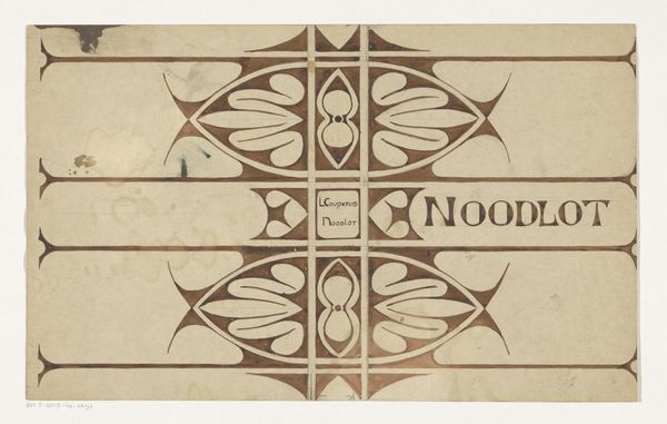
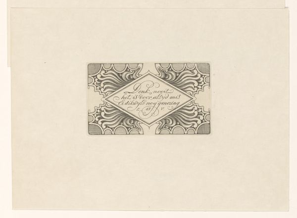
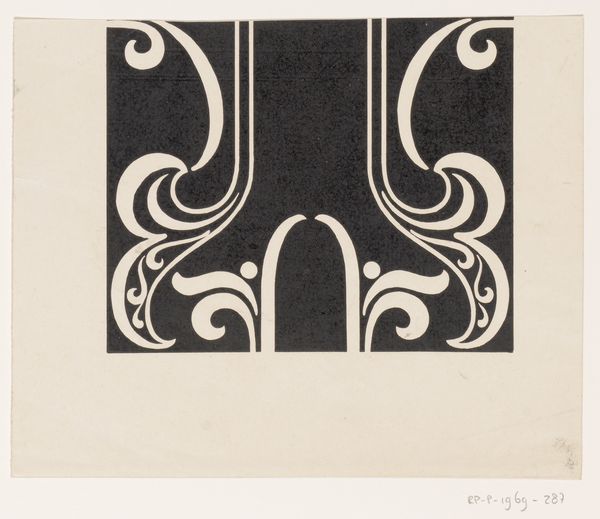
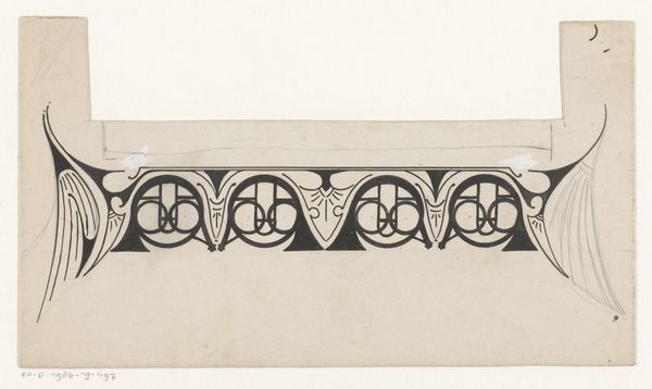
Dimensions: height 210 mm, width 346 mm
Copyright: Rijks Museum: Open Domain
Curator: Ah, look at this one, a design from 1898. It's titled "Bandontwerp voor: Louis Couperus, Noodlot," or "Cover design for: Louis Couperus, Fate" made by Reinier Willem Petrus de Vries. It is a design done with ink on paper, and destined to become the cover for a famous Dutch novel. Editor: I see right away what’s captivating; the overall somber tonality matched with the elegant patternwork lends a mood that really does feel aligned with "Noodlot", the Dutch word for Fate, as it reads so aptly on the cover itself. What are your first thoughts on the piece? Curator: Immediately I'm struck by the interplay of rigid structure and fluid, almost organic lines. There's such a push and pull, as the decorative and controlled elements seem like they're bursting from this very tightly geometric container, even suggesting Art Nouveau. It does seem symbolic of fate as constraint. Editor: Absolutely! Consider the implications of de Vries' choice to render "Noodlot" twice on this graphic design; the repetition functions almost like an incantation, drawing attention to the subject matter, the concept, if you will. What do you think about how his choices play with form and meaning? Curator: What fascinates me the most about is how de Vries balances the visual weight of typography. The rhythmic repetition suggests a relentless march toward an unavoidable outcome. It feels very psychological, doesn’t it? De Vries has managed to tap into something fundamental about how we experience stories—this feeling of inevitability as we read along! Editor: Well said! The structural elements such as symmetry also act as a very powerful device. It invites us to unpack its motifs on both structural and philosophical levels, doesn’t it? It goes to show, I suppose, that the real charm lies precisely where the artist manages to get these layers talking. Curator: And that kind of depth on a simple cover design – the gateway to the narrative experience – it is pretty captivating. The closer you look the more ideas blossom in your head. Editor: Exactly. I think after spending some time here I feel I could truly grasp what awaits the readers, just before even starting the book.
Comments
No comments
Be the first to comment and join the conversation on the ultimate creative platform.
More like this