Copyright: Callum Innes,Fair Use
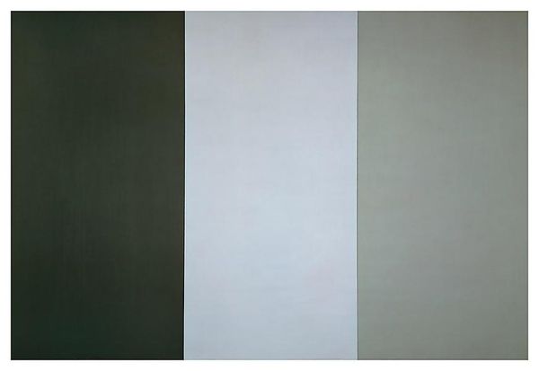
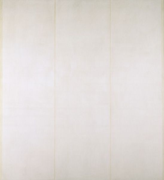
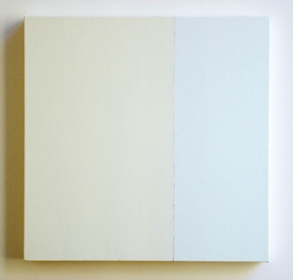
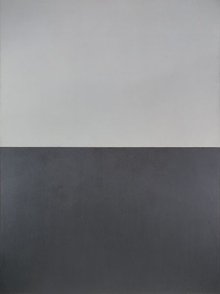
Curator: Right, let's discuss Callum Innes's "Exposed White Painting No. 3" from 1992. It's an acrylic on canvas, seemingly simple but deceptively complex. Editor: My first impression is… serenity, maybe? It’s so minimal, almost meditative. The two tones sitting side by side invite me to be silent. What do you think of the composition? Curator: The vertical division immediately creates a formal tension. On the left, we have this field of what seems to be unadulterated white, a stark expanse that emphasizes its own surface. But then the adjacent section is this kind of… spectral pale ocher or ghostly buff color. That opposing side suggests layers or some history to it. The line down the middle… It feels almost violently simple. Editor: Violent, yes! Like a crack opening up a pristine surface. But, at the same time, there is that monochrome aspect of the composition. Perhaps Innes is urging us to perceive the minute gradations, to acknowledge the subtle presence of color that exists even in what we perceive as empty. Are those subtle tonal variances on either side real, or just a play of light? Curator: They’re undoubtedly real and it speaks to Innes’s technique, known as “unpainting.” He pours thin washes of paint and then, with solvent, systematically removes layers. The ghost of colors left behind provides the painting with…affect, I suppose, rather than pure, pristine flatness. It brings back the gesture and also brings back accident to Minimalism. The “unpainting” becomes a new type of gesture. Editor: Fascinating. So, a sort of controlled erosion becomes the active principle? It challenges the notion of a painting as pure addition, an accumulation of gestures and layers, but instead becomes an act of paring down. I sense this sense of exposing something… hence, exposed white painting. It suggests not absence, but rather uncovering. I like how it questions painting as something fixed. Curator: Exactly. I suppose you could relate this exploration of subtractive methods with other Colour-field painters in its commitment to a vast colour surface, a reduced sense of depth and almost a monochrome sensibility. Editor: Yes! Seeing it that way, what looked simple now reveals all kinds of internal dynamic tension between addition, subtraction, and form and color! Curator: Precisely! And in that act of exposing, we’re compelled to reassess what constitutes a painting. Thank you for adding to my insight on that piece, this was an unexpected dive into color. Editor: And thank you. It seems I have to reconsider minimalism, I see now more affect than reduction when facing such geometric paintings.
Comments
No comments
Be the first to comment and join the conversation on the ultimate creative platform.