#
picture layout
#
pastel soft colours
# print
#
light coloured
#
joyful generate happy emotion
#
pastel colours
#
feminine colour palette
#
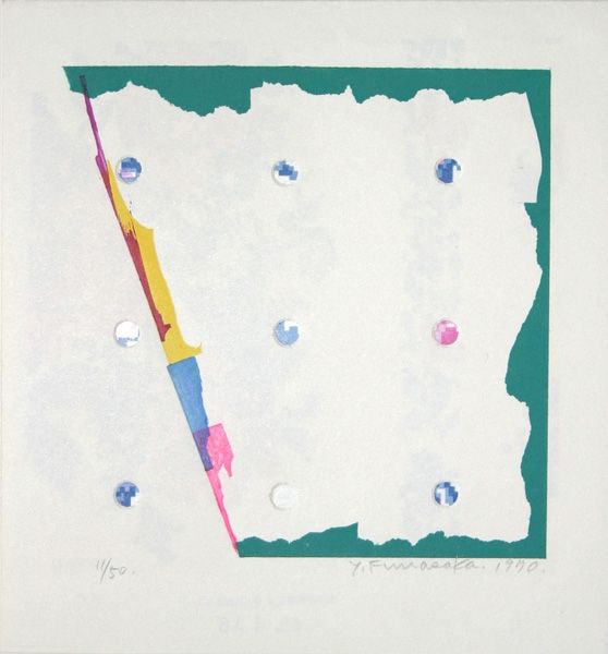
geometric
#
bright pastel
#
joyful element
#
abstraction
#
soft and bright colour
#
soft colour palette
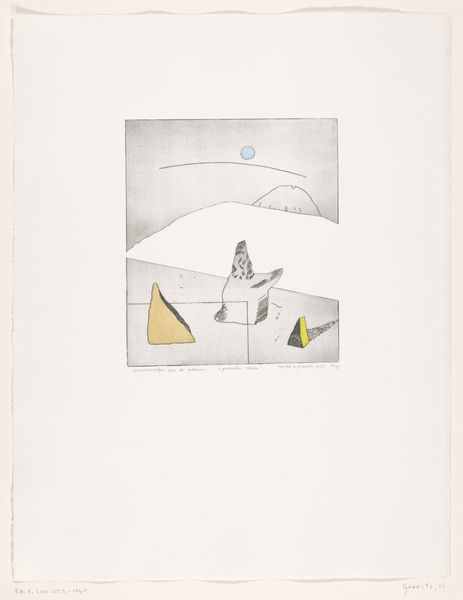
Dimensions: height 150 mm, width 140 mm, height 100 mm, width 100 mm
Copyright: Rijks Museum: Open Domain
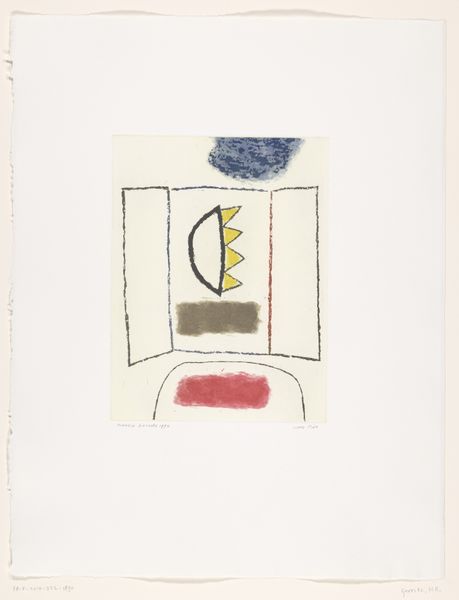
Harrie Gerritz made this small print, *Schildersezel in kleurrijk landschap,* using a graphic style with flat areas of colour. It's a celebration of the artist's tools, the easel and the painting, which is kind of meta, right? The texture in the gray sky area is so interesting. It's not smooth, and that roughness gives the whole thing a handmade, human feel. This reminds me that art is about process. It's not just about the final image but about the choices and the movements that the artist made along the way. The colours are super bold and kind of clash in a way that makes it really pop. There's a playful tension between the orderly shapes and the wild colours. The little painting on the easel is like a tiny version of the whole artwork, like a set of Russian dolls. It's as if Gerrit is saying that art is always reflecting on itself, always questioning what it is and what it can be. I'm reminded a little of Patrick Caulfield's flat planes of colour and simple, graphic style. Art’s a dialogue, isn’t it? A never ending conversation.
Comments
No comments
Be the first to comment and join the conversation on the ultimate creative platform.
More like this