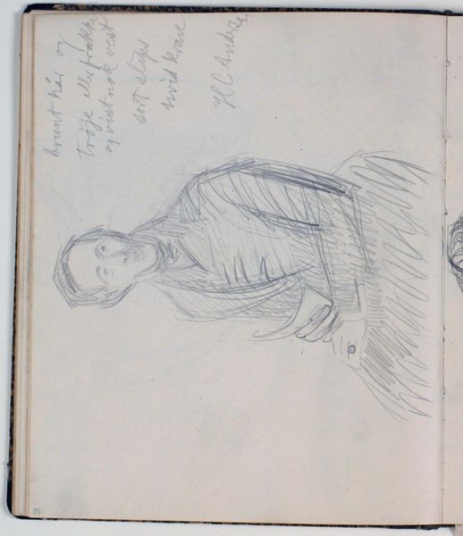
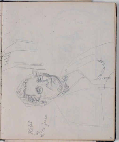
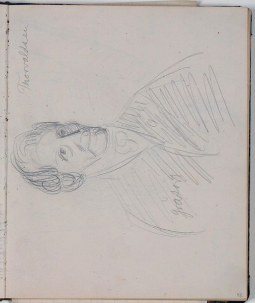
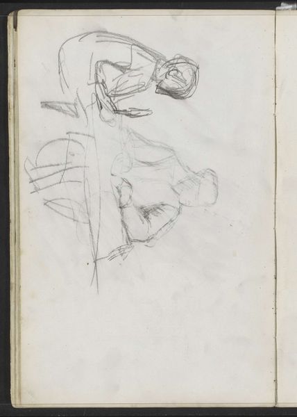
Studie af H. C. Ørsted efter maleri på Frederiksborg af C. A. Jensen 1842. Farveangivelser 1930 - 1936
0:00
0:00
drawing, pencil
#
portrait
#
drawing
#
pencil sketch
#
pencil
#
realism
Dimensions: 226 mm (height) x 185 mm (width) x 112 mm (depth) (monteringsmaal), 221 mm (height) x 184 mm (width) (bladmaal)
Editor: Here we have "Studie af H. C. Ørsted efter maleri på Frederiksborg af C. A. Jensen 1842. Farveangivelser" a pencil drawing by Niels Larsen Stevns, created between 1930 and 1936. It's a sketch, really, quite raw and immediate. The annotations suggest an exploration of colour values. What do you see in its formal qualities? Curator: The drawing’s strength lies precisely in its provisionality. Stevns isn’t trying to represent Ørsted in a mimetic sense. Instead, consider the dynamism of the lines: hatching that models form while simultaneously asserting the flatness of the page. The varying pressure of the pencil creates a subtle interplay of light and shadow. Observe the almost abstract rendering of the clothing, compared with the relatively more detailed facial features. Editor: Yes, there's a tension there. The face is quite defined, almost a finished portrait, while the rest feels very gestural, almost unfinished. Curator: Precisely. It becomes about the act of seeing, the process of translating three dimensions into two, more than the finished product. Think about the artist's mark. What does it tell you about the artistic decisions? Editor: It makes it feel very modern, despite the subject matter being a 19th-century portrait. It is more about capturing the essence rather than just the appearance. Curator: An insightful observation. The medium itself, pencil on paper, reinforces this sense of immediacy. It’s direct, unmediated. It offers an access into the artist's thought process in its barest form. What do you make of the colour notations then? Editor: Well, they break down the representational illusion, acting almost as an abstract code imposed on the figurative elements. That seems deliberate. I’m beginning to appreciate how it's as much about what it *isn’t* as what it *is*. Curator: Indeed. A work like this prompts a re-evaluation of our expectations regarding portraiture. Editor: Absolutely! I had initially viewed it as an incomplete copy but viewing the visual contrasts shows so much more intentionality in Stevns’ choices.
Comments
No comments
Be the first to comment and join the conversation on the ultimate creative platform.
More like this