drawing, lithograph, print
drawing
imaginative character sketch
narrative-art
lithograph
sketch book
figuration
personal sketchbook
idea generation sketch
sketchwork
line
sketchbook drawing
character design for animation
genre-painting
storyboard and sketchbook work
fashion sketch
sketchbook art
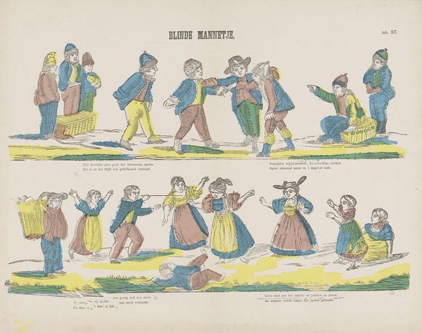
Dimensions: height 299 mm, width 396 mm
Copyright: Rijks Museum: Open Domain
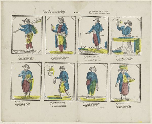
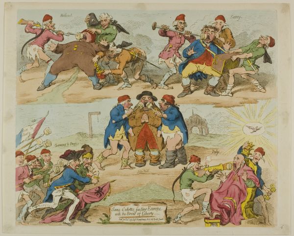
Editor: Here we have "Blinde mannetje" from sometime between 1848 and 1881, on display at the Rijksmuseum. The work combines lithograph, drawing, and printmaking techniques. I am really intrigued by the flatness and how the scenes feel stacked. How would you interpret its compositional strategy? Curator: Its arrangement on the page compels attention. Notice how the artist establishes separate registers, using line to demarcate each playful vignette. This division reinforces the autonomy of each scene, encouraging us to consider them as distinct structural elements within a unified whole. The colors, too, contribute to this separation, while simultaneously uniting the two scenes. What do you observe in the treatment of line? Editor: The lines appear rather simple and, in a way, quite economical. The choice gives the whole artwork a slightly cartoonish mood. It does not give much in terms of dimension, but flattens the image instead. Curator: Precisely. This consciously employed linearity serves to emphasize form and contour. Look closer; observe how the artist uses hatching and cross-hatching to suggest tonal variation, texture, and shadow within these defined forms. Are you not drawn to the tension between its flatness and suggested depth? Editor: I am now! I see the clever use of shadow to highlight a shape. I also see that it uses these to convey some action and give dimension to characters. How do you think we can look at this artwork differently? Curator: Considering it as a formal exercise, then. Dismiss all the references it makes, its period, culture. Simply attend to the surface; explore how the interaction of line, color, and form work. Editor: That’s such an interesting approach. By thinking about how it is constructed rather than what it represents. It really showcases how interconnected and deeply intertwined the artistic choices of representation can be! Curator: Indeed, understanding the internal logic of its composition allows a more comprehensive appreciation.
Comments
No comments
Be the first to comment and join the conversation on the ultimate creative platform.