print, textile, paper, typography, engraving
#
aged paper
#
hand written
#
hand-lettering
#
dutch-golden-age
# print
#
hand drawn type
#
hand lettering
#
textile
#
paper
#
personal sketchbook
#
typography
#
hand-drawn typeface
#
pen work
#
sketchbook drawing
#
sketchbook art
#
engraving
#
calligraphy
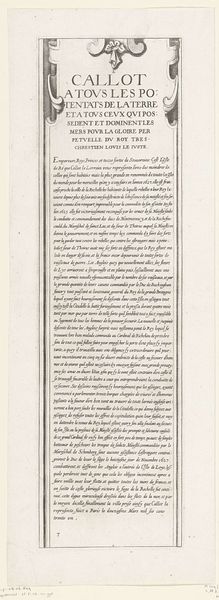
Dimensions: height 141 mm, width 190 mm
Copyright: Rijks Museum: Open Domain
This is a page from a book, created by Crispijn van de Passe II around the early 17th century, now held in the Rijksmuseum. The composition is dominated by dense blocks of text, sharply defined against the light background. Notice the interplay between uniformity and variation within the text. The consistent typeface and tight letter spacing create a sense of order, but this is disrupted by decorative elements such as the elaborate initial "A" and the ornamental seal at the top, which punctuate the otherwise linear flow. The use of typography as a visual element suggests a concern with both the communicative and aesthetic functions of the written word. The text isn't just conveying information; it is also an object of visual contemplation. The text invites us to consider how meaning is constructed through both linguistic and visual codes. It challenges us to decode not just what is being said, but how it is being presented.
Comments
No comments
Be the first to comment and join the conversation on the ultimate creative platform.
More like this