painting, print, watercolor
#
water colours
#
baroque
#
painting
# print
#
watercolor
#
coloured pencil
#
cityscape
#
watercolor
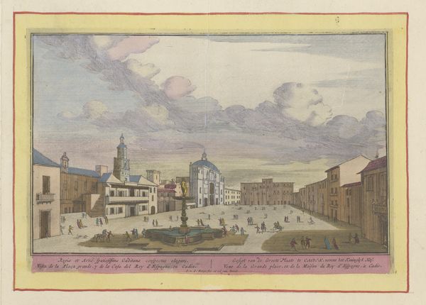
Dimensions: height 165 mm, width 250 mm
Copyright: Rijks Museum: Open Domain
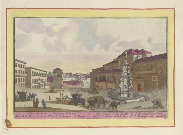
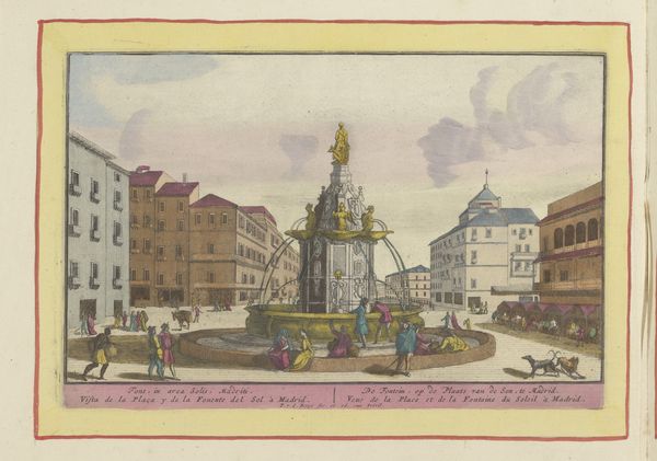
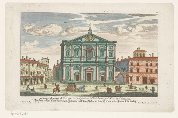
Editor: This is "Koninklijke gevangenis te Madrid," or Royal Prison in Madrid, made sometime between 1694 and 1737 by Pieter van den Berge. It looks like a print with watercolor, housed here at the Rijksmuseum. The colors give it a storybook quality, but the imposing architecture suggests something far more serious. What symbols do you see at play in this cityscape? Curator: It’s fascinating how cityscapes become containers for cultural memory. The prison itself, depicted with such prominent architectural detail, operates as a potent symbol. Notice the figures milling about – their presence transforms the prison from a mere building into a stage for social drama. Does their proximity to the prison suggest anything about the social order? Editor: It almost feels like the prison is integrated into daily life, doesn't it? Like it's part of the spectacle of the city. Curator: Precisely! The fountain, a classic symbol of civic pride and access to resources, juxtaposed against the prison, sets up a powerful tension. Consider, too, the horses and carriages. Who were these individuals visiting, and what did the prison represent to them psychologically? Prisons can often symbolize not just punishment, but also confinement, restriction, and even protection. Editor: I hadn’t considered the symbolism of the fountain and carriages in such direct opposition to the prison itself. Curator: Van den Berge subtly invites us to consider how power, justice, and everyday life intertwined in 18th-century Madrid. The seemingly innocuous details, from the fountain to the figures, construct a nuanced narrative about the social and psychological landscape of the city. The colors almost seem to attempt a sort of optimistic reading despite the image actually presented, but, does the image feel as an overall illustration works here in achieving a sense of total cohesiveness? Editor: That makes me wonder if the artist intentionally softened the blow with the color palette, attempting to reconcile this dark presence in an otherwise thriving city. Curator: Ultimately, this image provides layers of interpretation. By examining its visual language and symbolism, we glean deeper insights into the cultural consciousness of the time. Editor: Thank you, I am taking a new perspective on cityscapes.
Comments
No comments
Be the first to comment and join the conversation on the ultimate creative platform.
More like this