Copyright: Robert Mangold,Fair Use
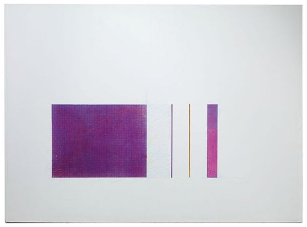
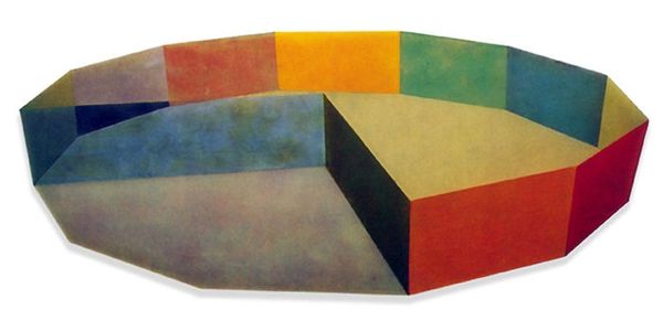
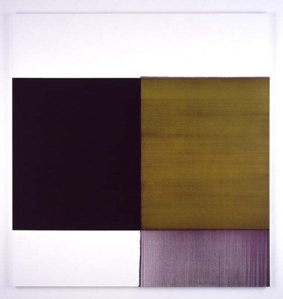
Editor: We’re looking at Robert Mangold's "Untitled (FCPA)" from 1995, a mixed-media work. The muted purple hues and simple geometric shapes create a surprisingly calming effect. How do you approach something that seems so understated? Curator: My initial impulse is to consider the materiality of this "mixed-media". How did Mangold manipulate these materials, likely paper, pigment, and graphite? Look closely. It isn’t about representation but a concern for the labour, and industrial systems in how that pigment achieves its toned presentation. It's an exploration of value isn’t it, through the use and quality of materials used. Editor: I see what you mean. It is more than just colour. The texture is almost fabric-like. Is there significance in choosing such basic shapes? The arch, the bars and the circles feel deliberately ordinary. Curator: Precisely. Mangold is actively rejecting the pretenses of "high art". By focusing on commonplace forms and mass-produced media he challenges the idea of artistic genius, reminding us that art-making involves choices about labour, consumption, and accessibility. The arch echoes architecture but it's really about a deliberate decision to produce rather than represent. Editor: So, the lack of expressive brushstrokes is a deliberate choice? It forces us to consider the work as an object itself, rather than an illusion? Curator: Exactly. Think about how the physical creation – the processes and materials used – defines the meaning as much as, or even more than, any symbolic intention. Editor: That's really changed how I see it. It's not just a simple geometric composition; it's a commentary on art production. Curator: Yes! And perhaps a subtle rebellion against traditional hierarchies within the art world. Editor: I will keep a closer eye to art production to appreciate their intent better.
Comments
No comments
Be the first to comment and join the conversation on the ultimate creative platform.
More like this