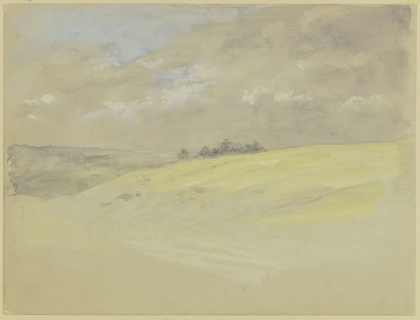
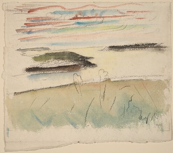
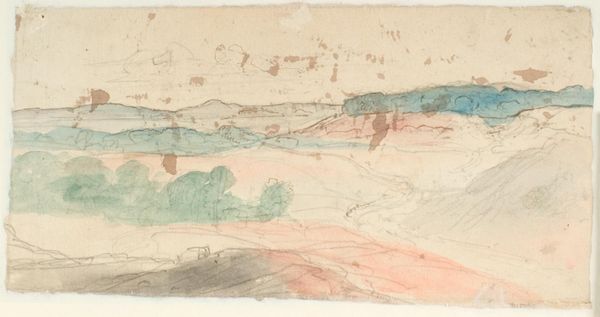
Poul S. Christiansen made Dyrnæs enge with watercolour and pencil, and there's a real freshness to it, a sense of being out in the landscape, trying to capture a fleeting impression. I love how Christiansen uses a limited palette, mostly muted yellows and browns, with touches of red and grey. It gives the whole piece a kind of hazy, dreamlike quality, like a memory fading at the edges. Look at the way he's rendered the clouds – just a few strokes of pencil, smudged and blended to suggest form and depth. It's so economical, so confident. Then there's that band of red, snaking across the middle ground. It’s a simple gesture but it really anchors the composition, adding a subtle tension to the piece. It reminds me a bit of something like a Bonnard or maybe even a Whistler, in the way it captures a specific mood. It’s a reminder that art isn't about perfect representation, but about feeling and seeing.
Comments
No comments
Be the first to comment and join the conversation on the ultimate creative platform.
More like this