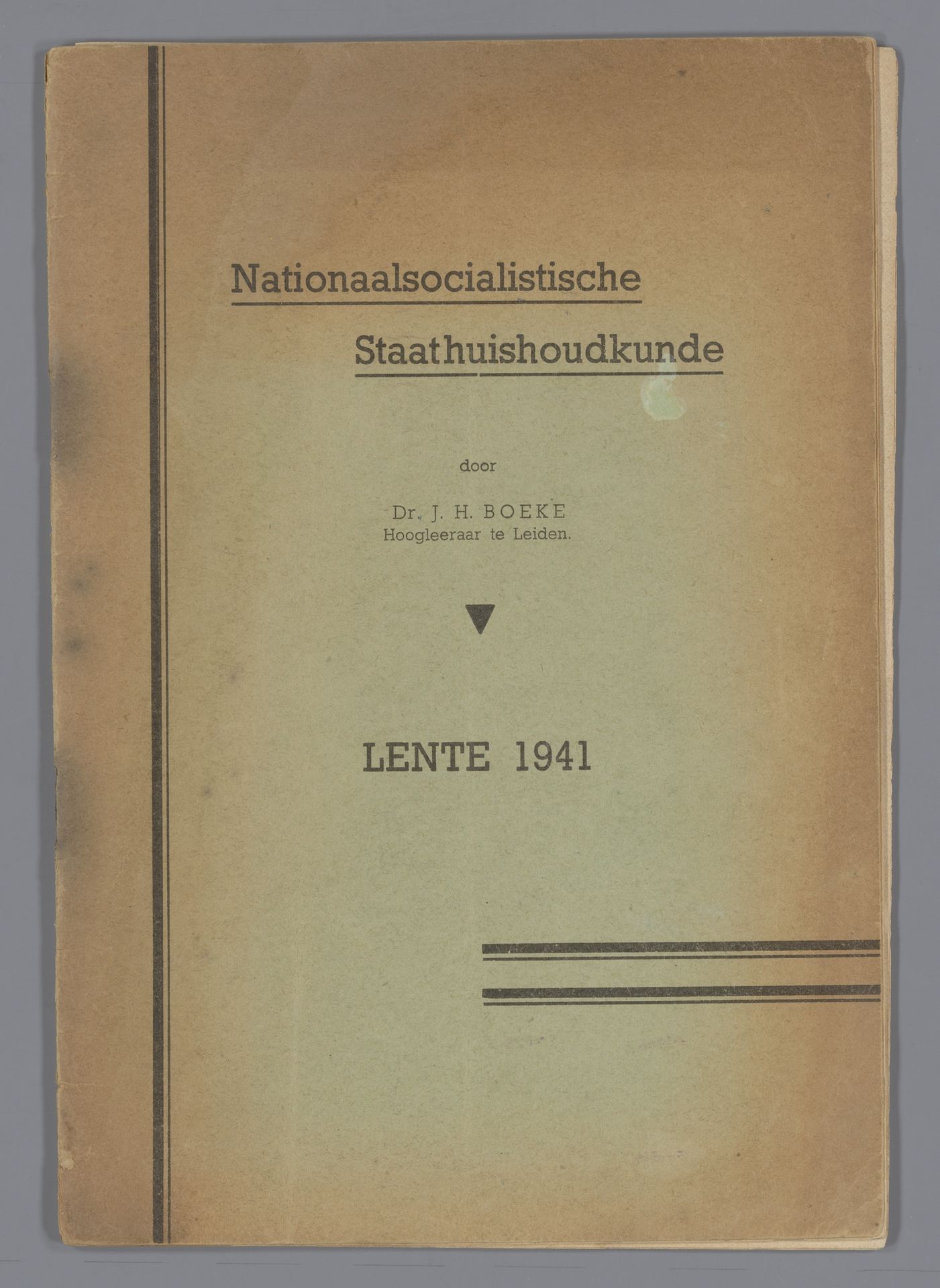
1941
Nationaal Socialistische Staathuishoudkunde
Listen to curator's interpretation
Curatorial notes
Editor: Here we have "Nationaal Socialistische Staathuishoudkunde," printed in 1941. It seems to be a paper-based print. The cover design is simple, mostly typography. How do you interpret this work? Curator: Structurally, it's fascinating. Note the deliberate hierarchy established through typography – the title rendered in a larger, bolder font immediately asserts dominance, followed by the author's name in a considerably smaller typeface, subtly underscoring a system of authority. Editor: The overall effect is quite austere. Almost...oppressive, despite the mundane material. Curator: Precisely. Observe also the placement of text, its calculated arrangement that directs the gaze. A geometric rigor governs the entire composition. The two vertical lines framing the print add visual anchors, reinforcing the rigid structure. What purpose might these aesthetic choices serve? Editor: Maybe to project a sense of order? The design choices convey stability, perhaps legitimizing the ideology within? Curator: An astute observation. Further analysis could explore the implicit contrast between this enforced order and the chaos of the historical moment. Even the imperfections – the visible wear and discoloration – become significant as they highlight the materiality and age of the document. Editor: So, even something as seemingly simple as the typography and layout choices become powerful tools of visual communication and influence. I’ll look closer at design elements from now on. Curator: Indeed. Formal elements rarely exist in isolation. They construct meaning, subtly and overtly.