print, textile, typography
#
dutch-golden-age
# print
#
book
#
textile
#
typography
#
historical font
Dimensions: height 258 mm, width 340 mm
Copyright: Rijks Museum: Open Domain
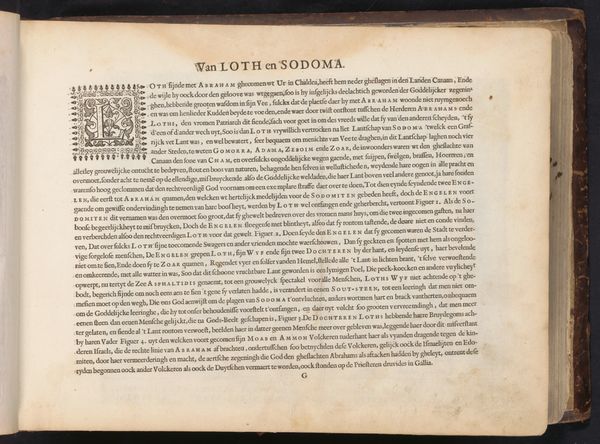
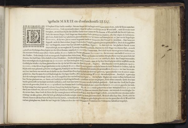
Curator: We're looking at an open book, a print dating back to 1646, titled "Van de Rechteren Israels die na Iosua geregeert hebben" by Jan Philipsz Schabaelje, held at the Rijksmuseum. It is an intriguing look at typography of the period. Editor: My first thought is how incredibly dense the text is. It feels weighty, like it holds a lot of serious pronouncements. It almost seems to absorb all the light. Curator: Indeed, the Dutch Golden Age aesthetic is certainly present here with an emphasis on historical font. You know this book provides accounts of biblical judges following Joshua. Jan Philipsz Schabaelje placed great importance on the word itself, understanding its transformative impact on readers during times of political and religious tension. Editor: Political and religious tension! Now, you're giving the heaviness I was intuiting context. Knowing this was printed in a period rife with upheaval, I see the choice of font as declarative. The text not only tells a story but makes a stand with its sheer presence, claiming space amid the tumult. Curator: Precisely! The materiality of the print matters too, consider how print provided wider dissemination of these religious and historical texts beyond just elites. Schabaelje was invested in increasing readership during this pivotal time in the Dutch Republic, amplifying progressive intellectual ideas related to republicanism and toleration. Editor: That reframes things! This isn’t merely a chronicle; it's a statement of purpose, aggressively promoting certain interpretations by virtue of its existence. Almost like planting a flag! The detailed opening on the left with its leafy tendrils framing a grand 'H' really drives that home. The typography in the piece really leans into legibility and declaration. I am impressed by its ability to embody these powerful values. Curator: Thinking about it within the context of post-Reformation intellectual history truly does open it up beyond a mere illustrated historical text, right? Editor: Exactly! The book seems a product of conviction. The aesthetic perfectly expresses its aim: to shape the social and ideological terrain around it.
Comments
No comments
Be the first to comment and join the conversation on the ultimate creative platform.
More like this