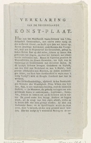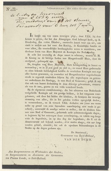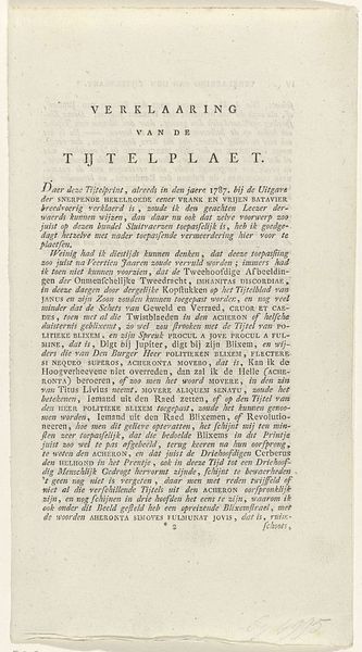
Kunsten en Wetenschappen, decoratie op de Noordermarkt, 1795 (uitleg) 1795
0:00
0:00
dirkmelandlangeveld
Rijksmuseum
print, paper, typography, poster
#
neoclacissism
#
aged paper
# print
#
old engraving style
#
hand drawn type
#
paper
#
personal sketchbook
#
typography
#
journal
#
sketchbook drawing
#
handwritten font
#
poster
#
sketchbook art
#
word imagery
#
columned text
Dimensions: height 193 mm, width 160 mm
Copyright: Rijks Museum: Open Domain
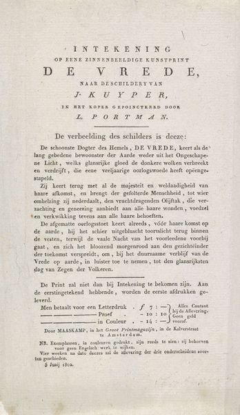
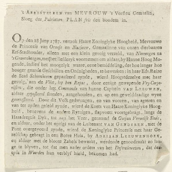
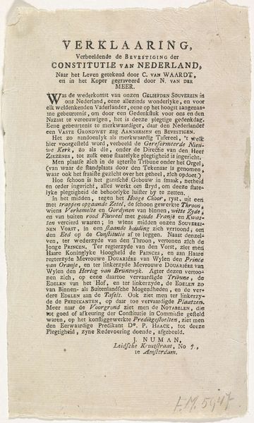
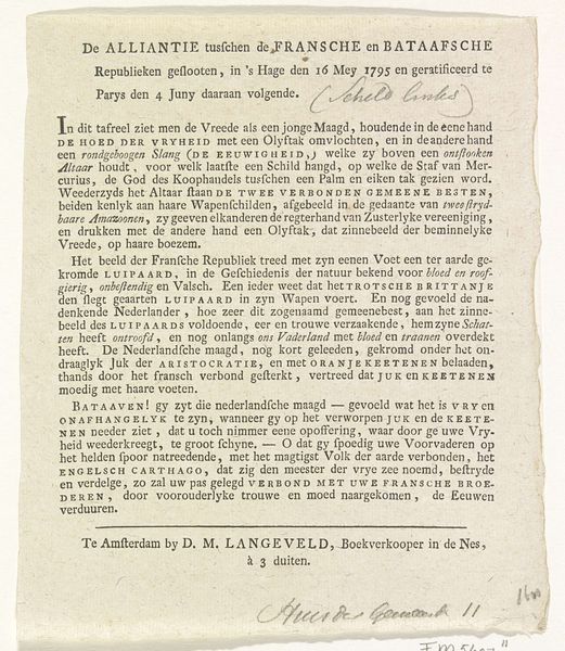
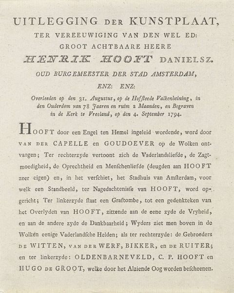
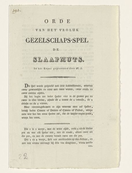
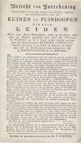
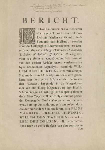
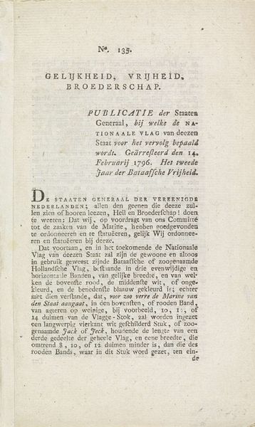
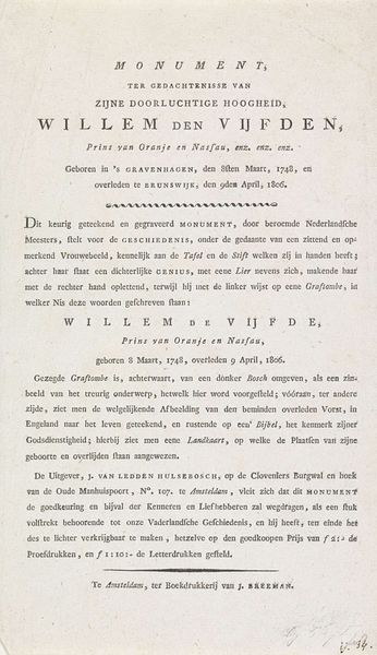
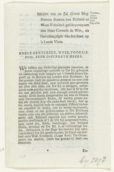
Editor: So, this print, titled "Kunsten en Wetenschappen, decoratie op de Noordermarkt, 1795 (uitleg)" by Dirk Meland Langeveld, from 1795… It feels like a page torn from a historical journal, almost a political broadside. What stands out to you in its composition? Curator: I’m drawn to the typography. Note the rigid, almost architectural structure given by the columned text. The varying sizes of font create a clear hierarchy, visually embodying the classical ideals of order and reason which underscore Neoclassicism. How do you perceive the relationship between text and image here? Editor: The words seem to be the image itself. I mean, there isn’t an explicit picture, right? It’s more like… word art? Curator: Precisely. Consider "MinerVA" dominating the top-left, guiding the reader into the symbolic allegories encoded within. Langenveld employs language not merely to inform, but to create a visual rhetoric. Do you see any symbolism arising out of this unique technique? Editor: Okay, I get it. It’s all about the ideas. The virtues, like "Vastheid en Zekerheid"… They’re constructed visually through the words themselves. The eagle wings attached to the oak wreath of citizenry express both zeal and resilience. All from handwritten letters. Curator: Indeed. And even the slight imperfections of the aged paper enhance its aesthetic effect, acting as an index of time, lending gravity to the text's claims of enduring values. It prompts consideration: how can graphic form embody ideals of virtue and civic duty? Editor: I hadn't thought about typography communicating ideas so directly. Thanks, that really shed light on it. Curator: My pleasure. Examining the formal aspects truly reveals deeper meaning here, I'd say.
Comments
No comments
Be the first to comment and join the conversation on the ultimate creative platform.
