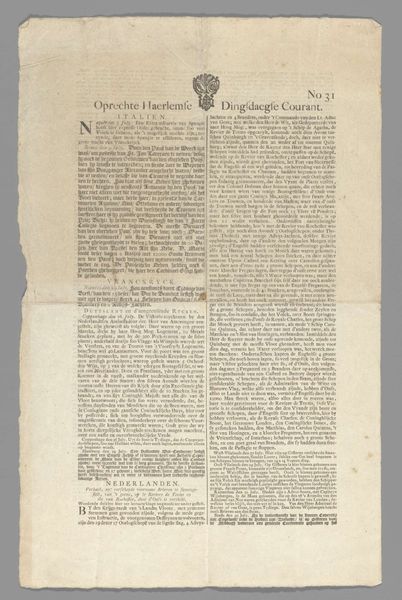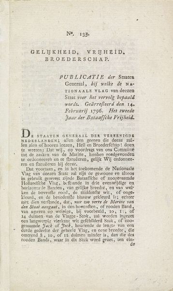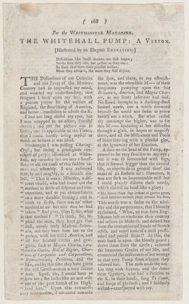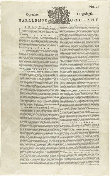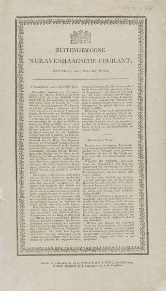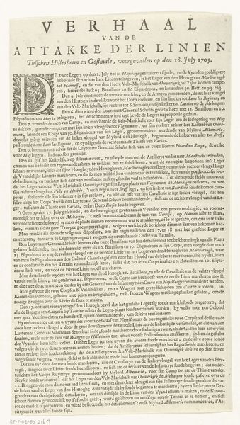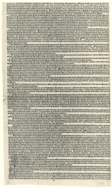
Verklaring bij de prent met de inhuldiging van Willem Frederik, prins van Oranje als souverein vorst, 1814 1814
0:00
0:00
jnuman
Rijksmuseum
print, typography, engraving
#
neoclacissism
#
hand-lettering
# print
#
old engraving style
#
hand drawn type
#
typography
#
hand-drawn typeface
#
fading type
#
ink colored
#
thick font
#
handwritten font
#
engraving
#
historical font
#
columned text
Dimensions: height 220 mm, width 135 mm
Copyright: Rijks Museum: Open Domain
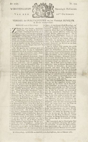
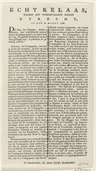
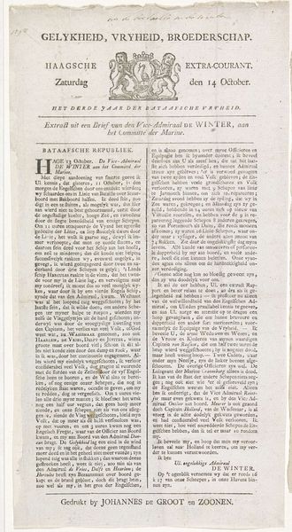
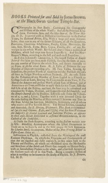
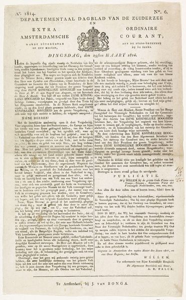
Curator: This print, held at the Rijksmuseum, is titled "Verklaring bij de prent met de inhuldiging van Willem Frederik, prins van Oranje als souverein vorst, 1814"—or, "Explanation of the print of the inauguration of William Frederick, Prince of Orange as Sovereign Prince, 1814." It's an engraving by J. Numan. What are your first thoughts? Editor: My first impression is of stark formality. The rigid columns of text and the monochrome palette create a sense of austerity, almost severe. Curator: Indeed. The print commemorates a pivotal moment: William Frederick assuming sovereignty, a key event following the Napoleonic era. The typography itself evokes a sense of history and authority, aligning with the political messaging. It's a celebration of the new constitution. Editor: Absolutely. And consider the composition – the careful arrangement of text blocks, the emphasis on linear precision. The engraver meticulously balanced the visual elements to communicate order and stability, qualities one might seek in times of post-war reconstruction. It echoes the visual language of neoclassicism, reflecting its emphasis on order and reason. Curator: Right. Note also the sheer amount of text. It points to a culture that values reasoned argument and the written word in legitimizing political power. It invites scrutiny but from a position of established authority. It is intended not just to depict but to thoroughly explain. Editor: From a formal perspective, this focus can be seen in the font choices, these very solid, thick fonts that demand attention. You also notice how it almost appears columned to provide clear organization that invites the viewer to analyze each portion independently. Curator: Furthermore, prints like these were important tools for disseminating information and shaping public opinion in the 19th century. The print's focus isn't just the event, but framing how the Dutch should interpret it and, crucially, participate in the new political structure. Editor: Yes, this detailed engraving is not simply informational; it's persuasive. Each line, each carefully chosen typeface contributes to an overarching message of legitimacy and power, as viewed by those in control. Curator: Looking closely reveals this is a carefully orchestrated piece of propaganda. This detailed description provides insights into not just the event itself, but into the socio-political priorities of the time. Editor: Considering its emphasis on structure and explicit clarity, I better appreciate its function today. It's a window into how those events and actors wanted to be perceived.
Comments
No comments
Be the first to comment and join the conversation on the ultimate creative platform.
